
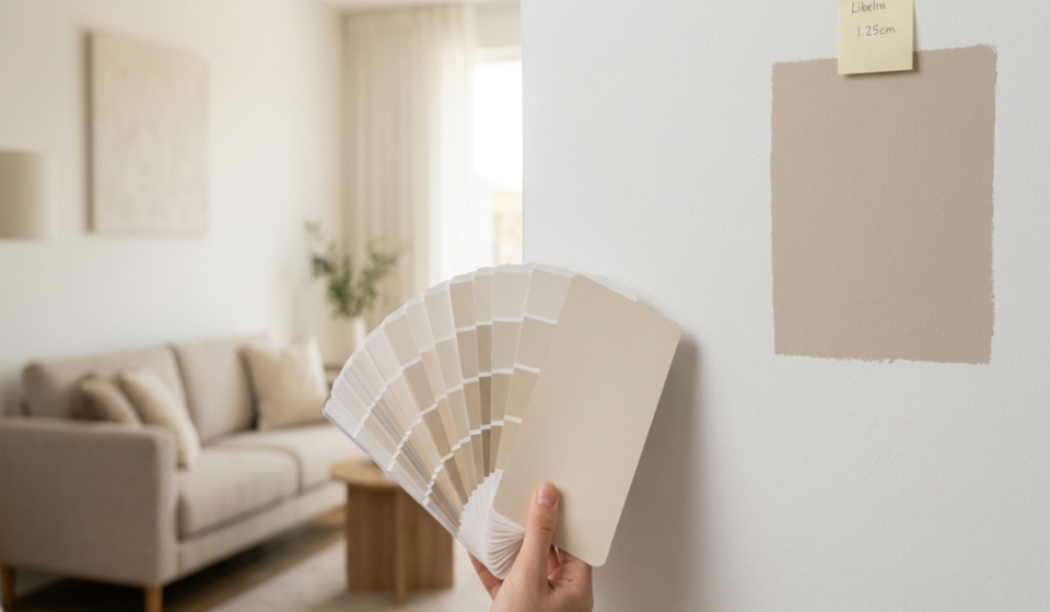

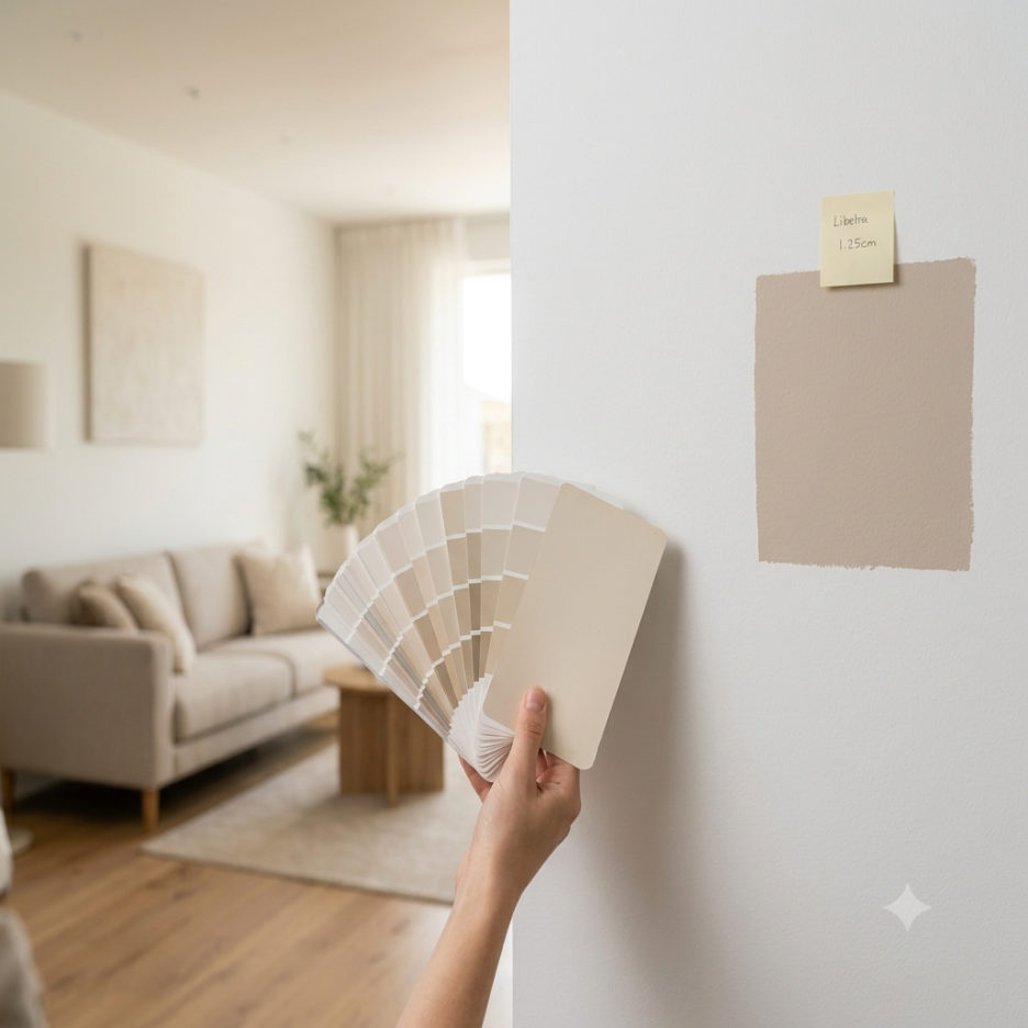
Why paint color failure stories are so easy to read: Hello, this is Caripaint. Today, rather than a review from a specific job site, I want to talk about the paint color failure stories that seem to be showing up especially often on blogs and social media lately. You choose a beautiful color, but once it is on the wall it looks dark, or it looked calm in the store but appears yellow at home, and I think posts like these get views not just because they are entertaining, but because they make people worry, “That could happen to me too.”
컬러 실패담이 잘 읽히는 이유 안녕하세요, 카리페인트입니다. 오늘은 특정 현장 후기가 아니라, 요즘 블로그와 SNS에서 유독 잘 보이는 ‘컬러 실패담’ 이야기를 해보려고 합니다 예쁜 색을 골랐는데 막상 벽에 바르니 어둡고, 매장에서는 차분했는데 집에서는 노랗게 보이는 경험. 이런 글이 조회되는 건 단순한 재미보다 ‘나도 그럴 수 있다’는 불안이 크기 때문인 것 같아요. 😊
Understanding Paint Color Perception_페인트 색상 인식 이해하기
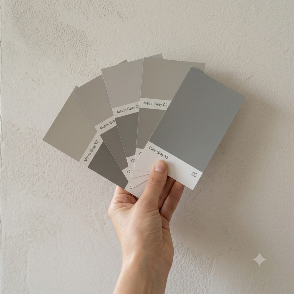
Colors look different on a small chip than they do on a large wall. The small chips you see on a paint color chart feel less overwhelming because the area is so small. But when that same tone goes up across an entire wall, the saturation and brightness often feel much stronger. Surprisingly, colors that seem safe, such as gray, beige, and ivory, can be especially difficult because they may look bluish depending on the lighting, appear yellow, or create a mood you did not expect when paired with the existing flooring.
색은 작은 칩과 큰 벽에서 다르게 보입니다 페인트 색상표에서 보는 작은 칩은 면적이 작아서 부담이 덜합니다. 그런데 같은 톤이 벽 전체로 올라가면 채도와 명도가 훨씬 강하게 느껴질 때가 많습니다. 특히 회색, 베이지, 아이보리처럼 무난해 보이는 계열이 의외로 어렵습니다. 조명에 따라 푸르게 보이거나, 노랗게 뜨거나, 기존 바닥재와 만나면서 예상과 다른 분위기가 나오거든요. 😅
Color Failure Stories Appeal_컬러 실패담의 매력
The failure stories that get views have points people can relate to. The reason paint color failure stories are fun to read is that the results are so clear. Before the work, people expect the space to look bright and spacious, but afterward the before-and-after immediately shows a room that feels stuffy or cold. Another point is that you only realize it after spending both time and money. Wallpaper and film are similar, but once an entire wall finish is done, it is not easy to undo, so someone else’s failure story quickly becomes a checklist for my own estimate.
조회되는 실패담에는 공감 포인트가 있습니다. 컬러 실패담이 재밌게 읽히는 이유는 결과가 선명해서입니다. 시공 전에는 화사하고 넓어 보일 줄 알았는데, 시공 후에는 답답하거나 차갑게 느껴지는 비포&애프터가 눈에 바로 들어오죠. 또 하나는 비용과 시간이 들어간 뒤에야 알게 된다는 점입니다. 도배나 필름도 마찬가지지만, 벽 전체 마감은 한 번 진행하면 쉽게 되돌리기 어렵습니다. 그래서 다른 사람의 실패담이 곧 내 견적 전 체크리스트가 되더라구요.
Practical ways to reduce mistakes_실패를 줄이는 현실적인 방법
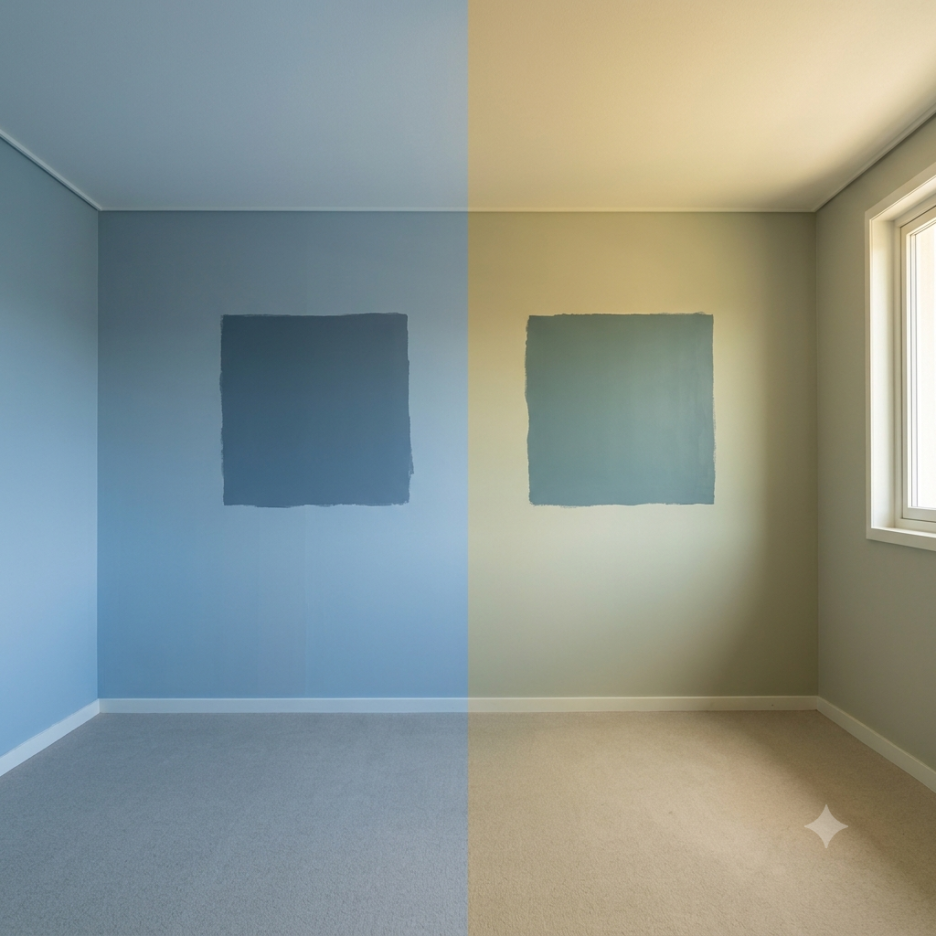
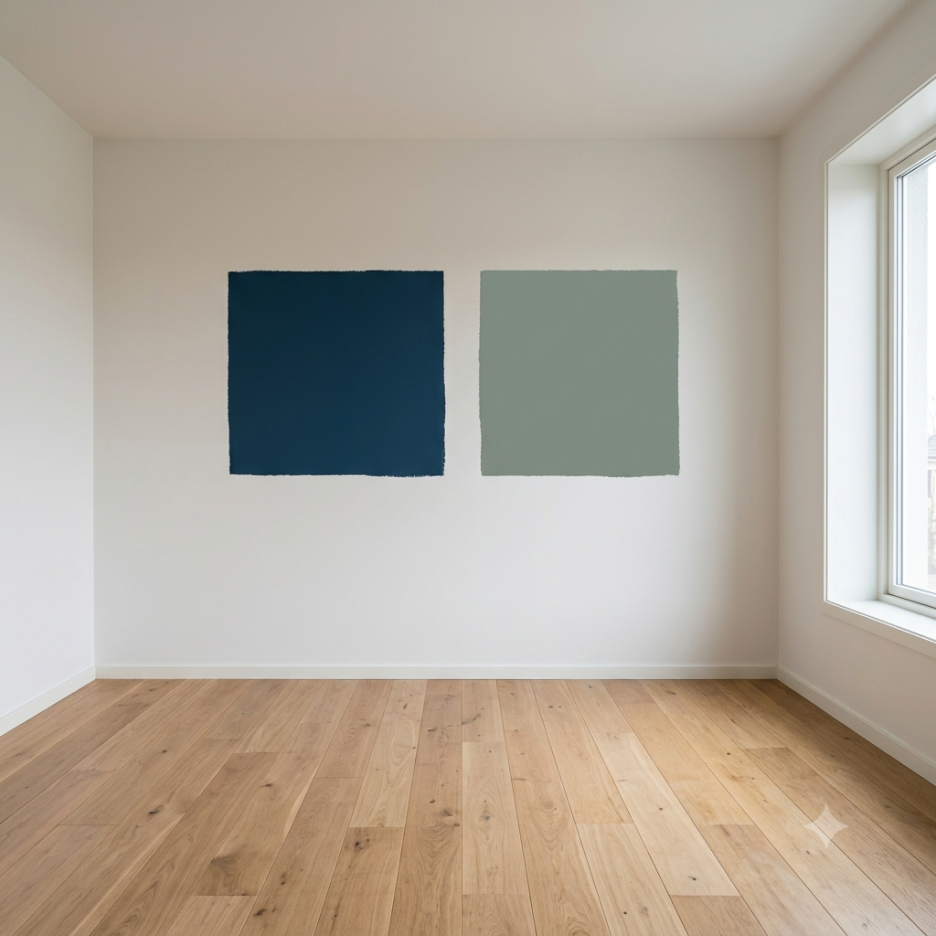
The best method is to apply a small sample to the actual wall. If you look at it separately during the day, in the evening, and with the lights on, the same color can appear quite different.
가장 좋은 방법은 작은 샘플을 실제 벽에 올려보는 것입니다. 낮, 저녁, 전등을 켰을 때를 나눠서 보면 같은 색도 꽤 다르게 보입니다.
Choosing the Right Paint Color_올바른 페인트 색상 선택하기
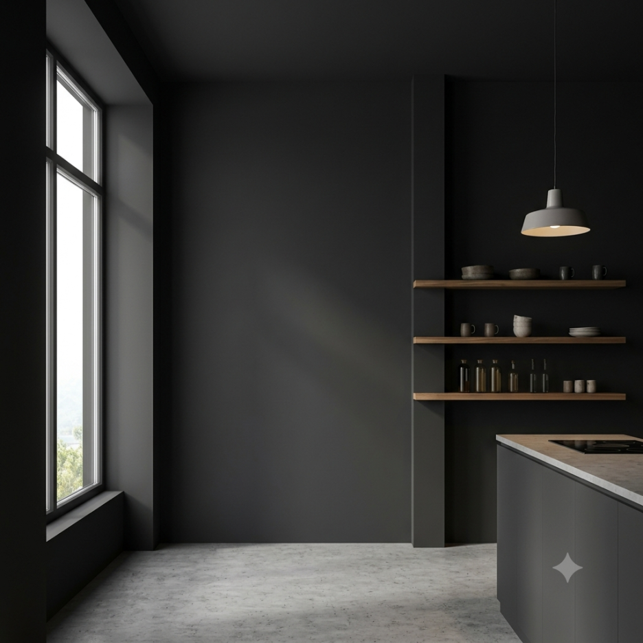
It is also a good idea to decide after seeing a large sample from a neighbor, acquaintance, or interior design company that has used the color you want. And you should not look only at the color, but also at the surrounding elements. The flooring, door frames, furniture, curtains, and even the color temperature of the lighting all need to work together for the tone of the space to feel balanced. Why paint is helpful when you are struggling with color is that it offers a wide range of tone adjustment. Wallpaper comes with its own patterns and textures, and film tends to have a strong material-like feel. Paint can shape the image of a space more delicately depending on whether it is matte or low-sheen and how deep the color is. Of course, simply choosing a pretty color is not enough. As I mention repeatedly, the actual result will only feel stable when surface preparation, sanding, masking, the painting method, and the final finish check are all handled properly.
또는 원한 색상으로 인테리어를 한 이웃주민이나 지인, 인테리어 회사에서 큰 크기의 샘플을 보고 결정하는 게 좋습니다. 그리고 색만 보지 말고 주변 요소를 같이 봐야 합니다. 바닥재, 문틀, 가구, 커튼, 조명 색온도까지 어울려야 공간의 톤이 안정됩니다. 페인트가 컬러 고민에 유리한 점 페인트의 장점은 톤 조절의 폭이 넓다는 데 있습니다. 도배는 패턴과 질감이 함께 따라오고, 필름은 자재 느낌이 강한 편인데요. 도장은 무광, 저광, 색 농도에 따라 공간 이미지를 섬세하게 잡을 수 있습니다. 물론 예쁜 색을 고르는 것만으로 끝나지는 않습니다. 반복적으로 말씀드리지만, 면 정리, 샌딩, 보양, 도장 방식, 마감 확인까지 따라와야 실제 결과가 안정적으로 나옵니다.
실패담은 결국 좋은 선택을 위한 과정입니다
컬러 실패담이 조회되는 이유는 남의 실수를 구경하려는 마음만은 아닙니다. 내 공간에서는 같은 실수를 줄이고 싶은 마음, 그리고 더 나은 선택을 하고 싶은 마음이 함께 있기 때문입니다. 집이나 상가의 페인트 색상 선택이 고민되신다면, 현장 상황에 따라 어울리는 방향을 함께 잡아드릴 수 있습니다. 공간을 지금보다 더 가치있게 만드는 카리페인트, 견적 문의 편하게 남겨주세요 ✨
함께 보면 좋은 글
2026 Trends: Top 3 Recommended Paint Colors Without Fail
2026 트렌드] 실패 없는 페인트 컬러 추천 TOP 3
Support] Red Color and Vintage Staco Accent, Jokbal Factory (feat. Neon Lighting)
Support] 레드컬러와 빈티지스타코 포인트, 족발팩토리(feat. 네온 조명)
Exposed Concrete Apartment, Warm and Calm with Dun Edward 🌞
노출 콘크리트 아파트, 던에드워드로 따뜻하고 차분하게🌞
여러분의 공간을 지금보다 더 가치있게 만드는
카리페인트
망설이지 마시고 문의주세요! ↓↓↓