Middle School Corridor and Stair Paint: Why Color Blocking Matters | 중학교 복도 계단 페인트, 색 나누기가 이렇게 중요합니다

Middle School Common Area_중학교 공용부
Hello, this is Kari Paint. Today we are looking at a middle school corridor and stair common area finished with interior water-based paint in several colors.
안녕하세요, 카리페인트입니다. 오늘은 여러 색상의 내부 수성 페인트로 마감한 중학교 복도와 계단 공용 공간을 살펴보겠습니다. 😊
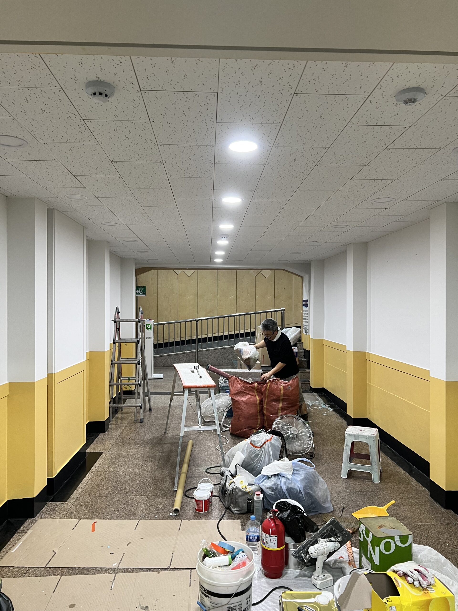
School corridor yellow lower wall
학교 복도 하부 벽면의 노란색 도장
A school corridor is not only a passage. It is a wall that meets bags, hands, shoes, cleaning tools, and daily movement again and again.
학교 복도는 단순한 통로가 아닙니다. 가방, 손, 신발, 청소 도구, 그리고 일상적인 움직임이 반복해서 닿는 벽입니다.
Color Layout_색 배치
The main color layout in this site is a bright upper wall with a stronger lower color. Yellow lower walls appear in the corridor, while blue lower walls appear around the stair and another common wall zone.
이 현장의 주요 색상 구성은 밝은 상부 벽면에 더 강한 하부 색상을 배치한 방식입니다. 복도에는 노란색 하부 벽면이 보이고, 계단 주변과 또 다른 공용 벽면 구역에는 파란색 하부 벽면이 보입니다.
In this site, the bright upper wall and vivid lower color are the key points. On the corridor side, the yellow lower wall continues in a long band, while the stair area and some wall surfaces are organized with a blue-toned lower section, creating a different rhythm in each space.
이번 현장은 밝은 상부 벽과 선명한 하부 컬러가 포인트입니다. 복도 쪽은 노란색 하부가 길게 이어지고, 계단과 일부 벽면은 파란색 계열 하부로 정리되어 공간마다 다른 리듬이 생겼습니다.
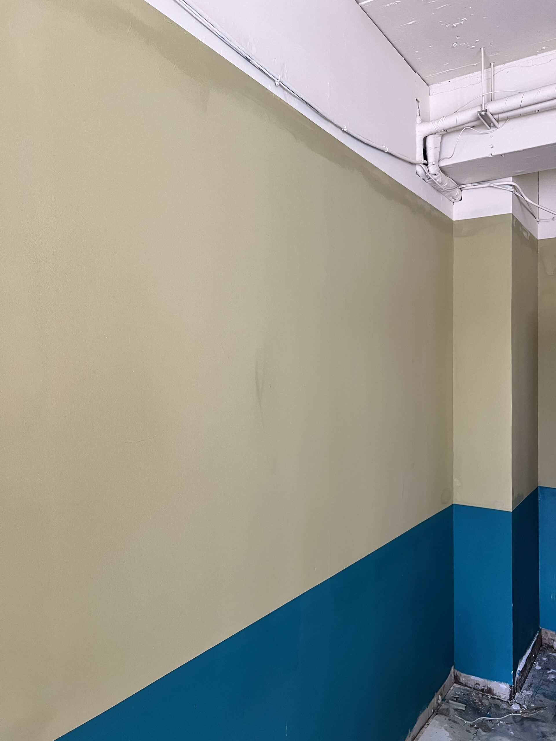
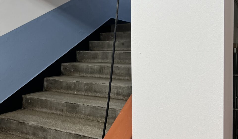
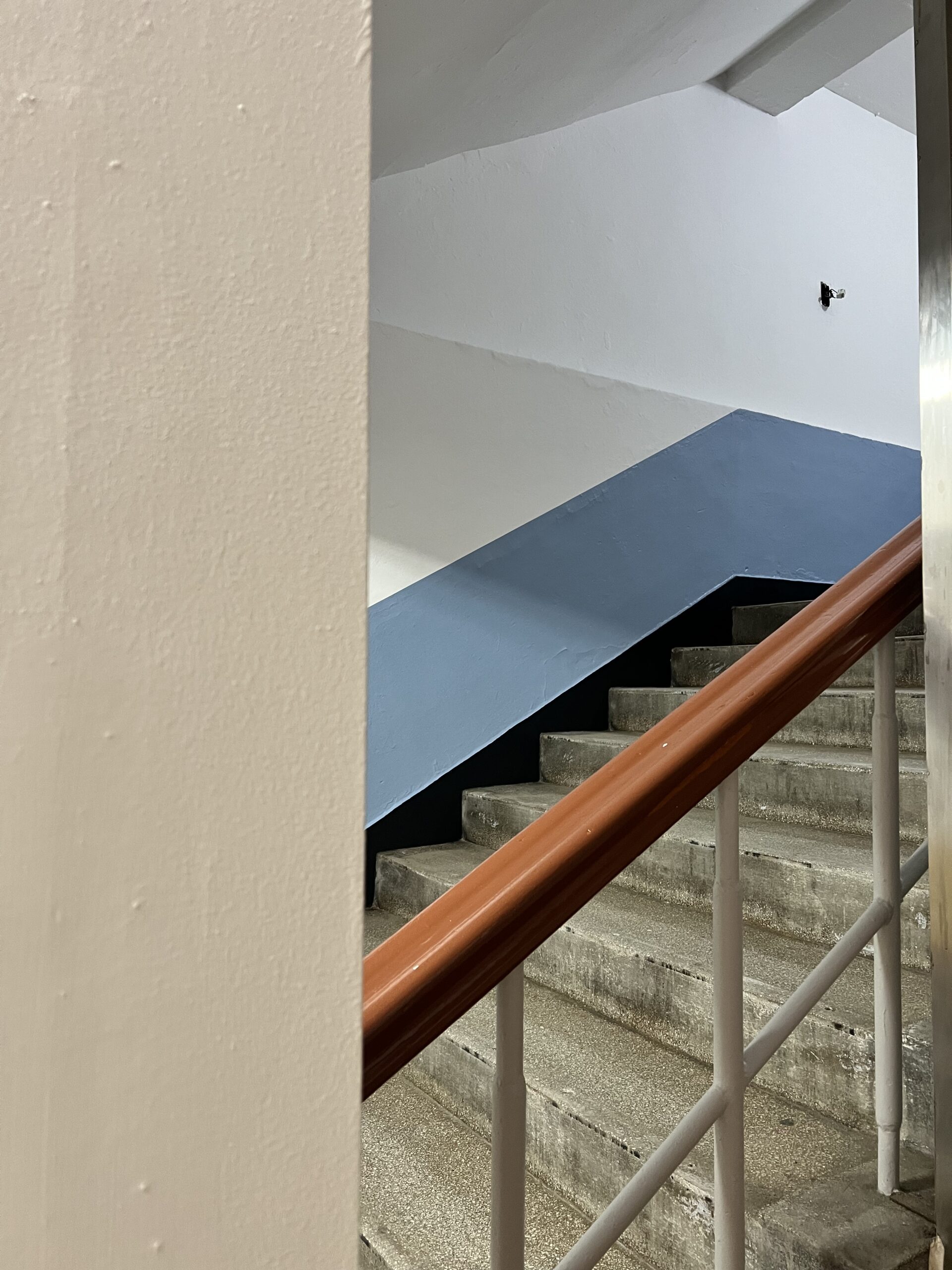
School stair blue lower wall
학교 계단 하부 벽면의 파란색 도장
Color division works well when the line height, corner return, column face, and stair angle are read together. If only the front wall looks clean and the corner breaks awkwardly, the common area can look unfinished. Color blocking is not just drawing one straight line neatly. The wall height, column corners, stair diagonals, and the lower line that looks like a black baseboard all need to align together for the whole space to look organized.
색 나누기는 선 하나만 반듯하게 긋는 일이 아닙니다. 벽 높이, 기둥 모서리, 계단 사선, 검정 걸레받이처럼 보이는 하부 라인이 같이 맞아야 전체가 정돈되어 보여요.
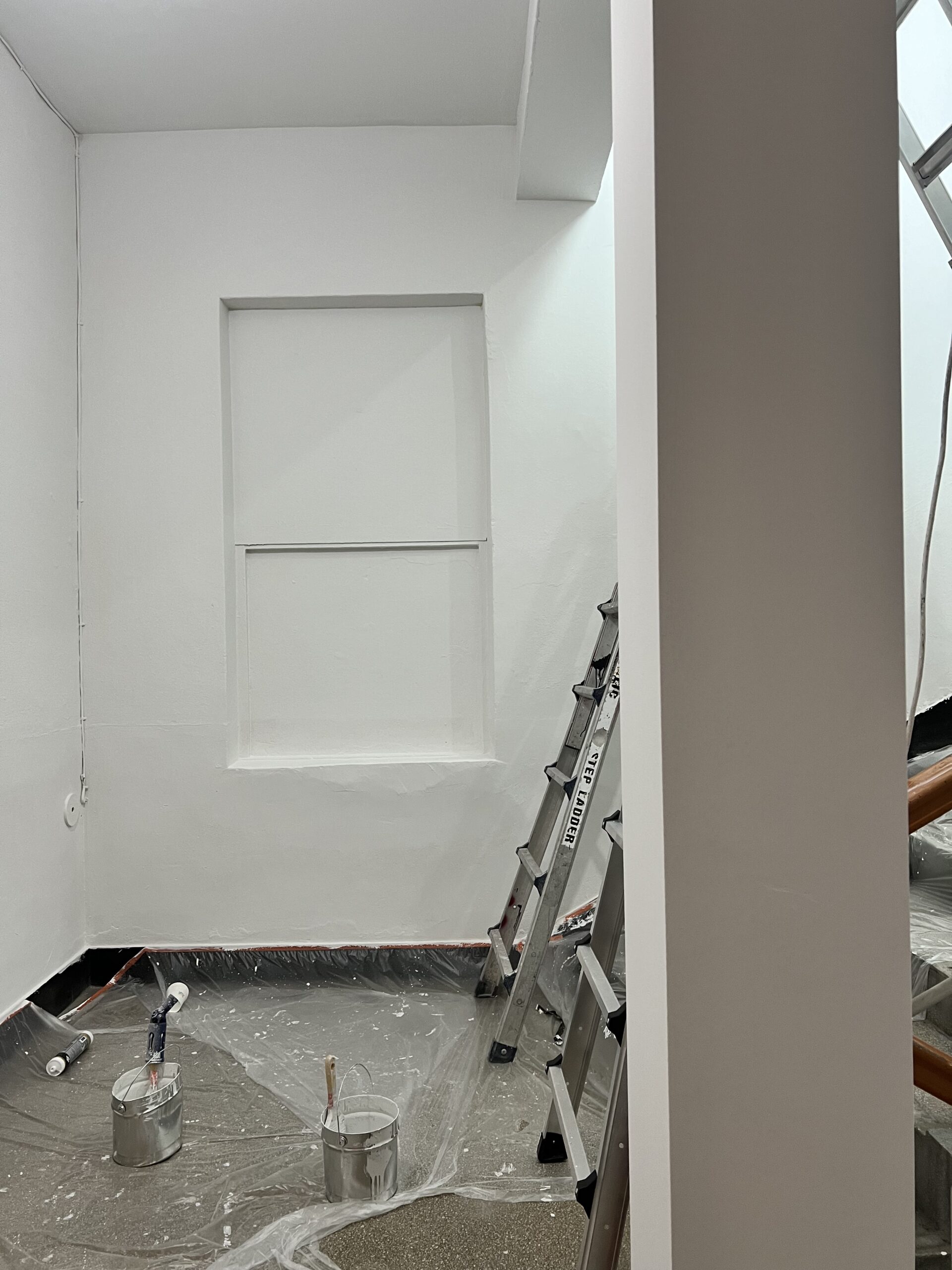
Painted wall color boundary
도장된 벽면의 색상 경계
In Korean school buildings, stair walls often have old concrete texture, existing repair marks, and strong ceiling light. These details make color lines look more visible than expected.
한국의 학교 건물에서는 계단 벽면에 오래된 콘크리트 질감, 기존 보수 흔적, 강한 천장 조명이 있는 경우가 많습니다. 이런 요소들은 색상 경계선을 예상보다 더 눈에 띄게 만듭니다.
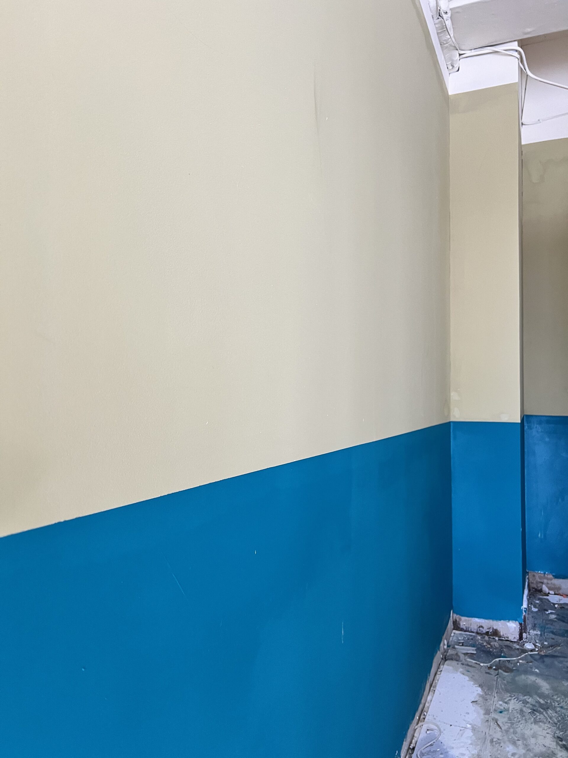
In shared areas of Korean schools, the existing wall unevenness, repair marks, and ceiling lighting are often visible together. As in the photo, when viewed up close, the wall texture remains apparent, so if the color boundary becomes uneven, it catches the eye faster than expected.
한국 학교 공용부는 기존 벽의 요철, 보수 흔적, 천장 조명이 함께 보이는 경우가 많습니다. 사진처럼 가까이서 보면 벽의 질감이 그대로 살아 있기 때문에 색 경계가 흐트러지면 생각보다 눈에 빨리 들어옵니다. 😅
Paint Choices_페인트 선택
For a school common area, interior water-based paint is usually considered first because odor, schedule, and later maintenance all have to be reviewed together. The exact choice should match the substrate, color plan, supply, and repair standard. In this post, we will compare only the products confirmed as selection criteria suitable for corridors and stairs, as seen in the site photos.
학교 공용부는 냄새, 일정, 보수성을 같이 봐야 해서 내부 수성 페인트 기준으로 검토하는 경우가 많습니다. 이번 글에서는 사진 속 현장처럼 복도와 계단에 어울리는 선택 기준으로 작업을 진행했습니다.
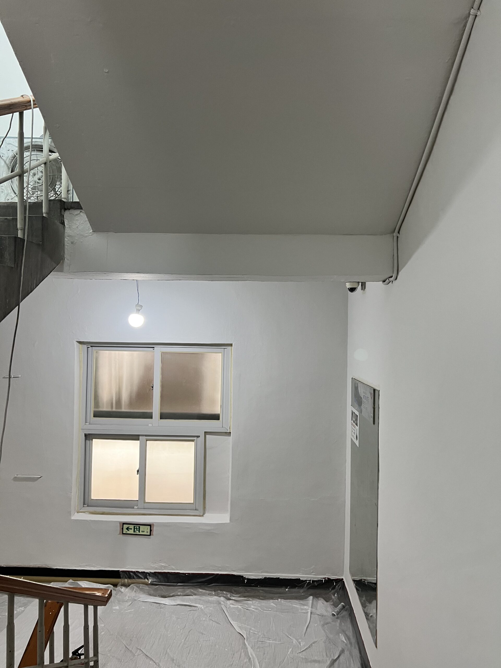
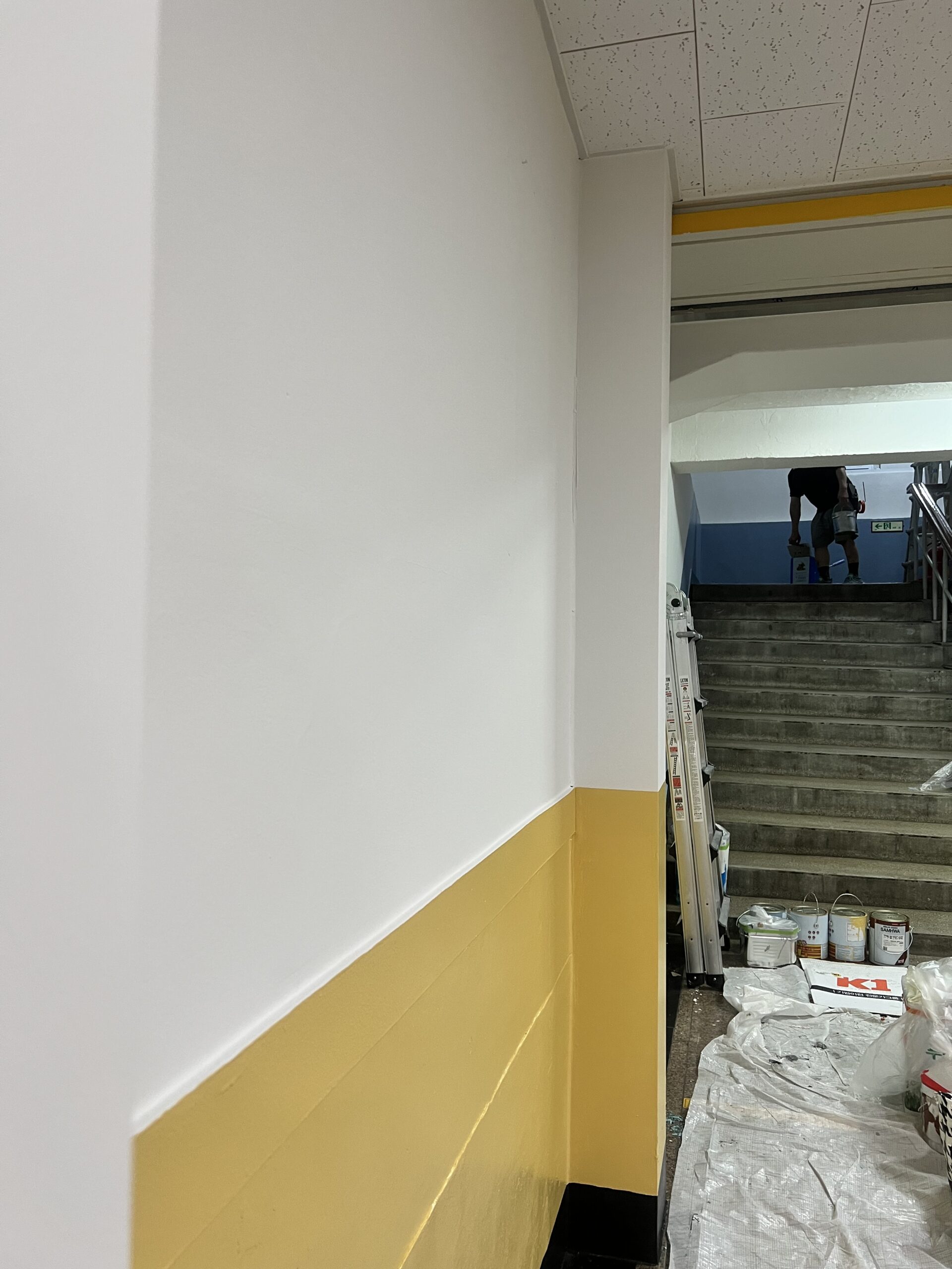
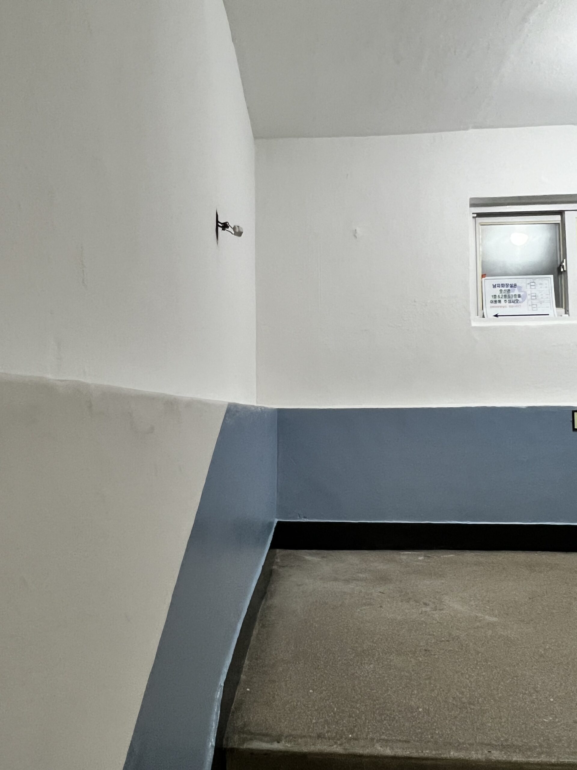
Sharp Color Line_칼같은 색 나누기
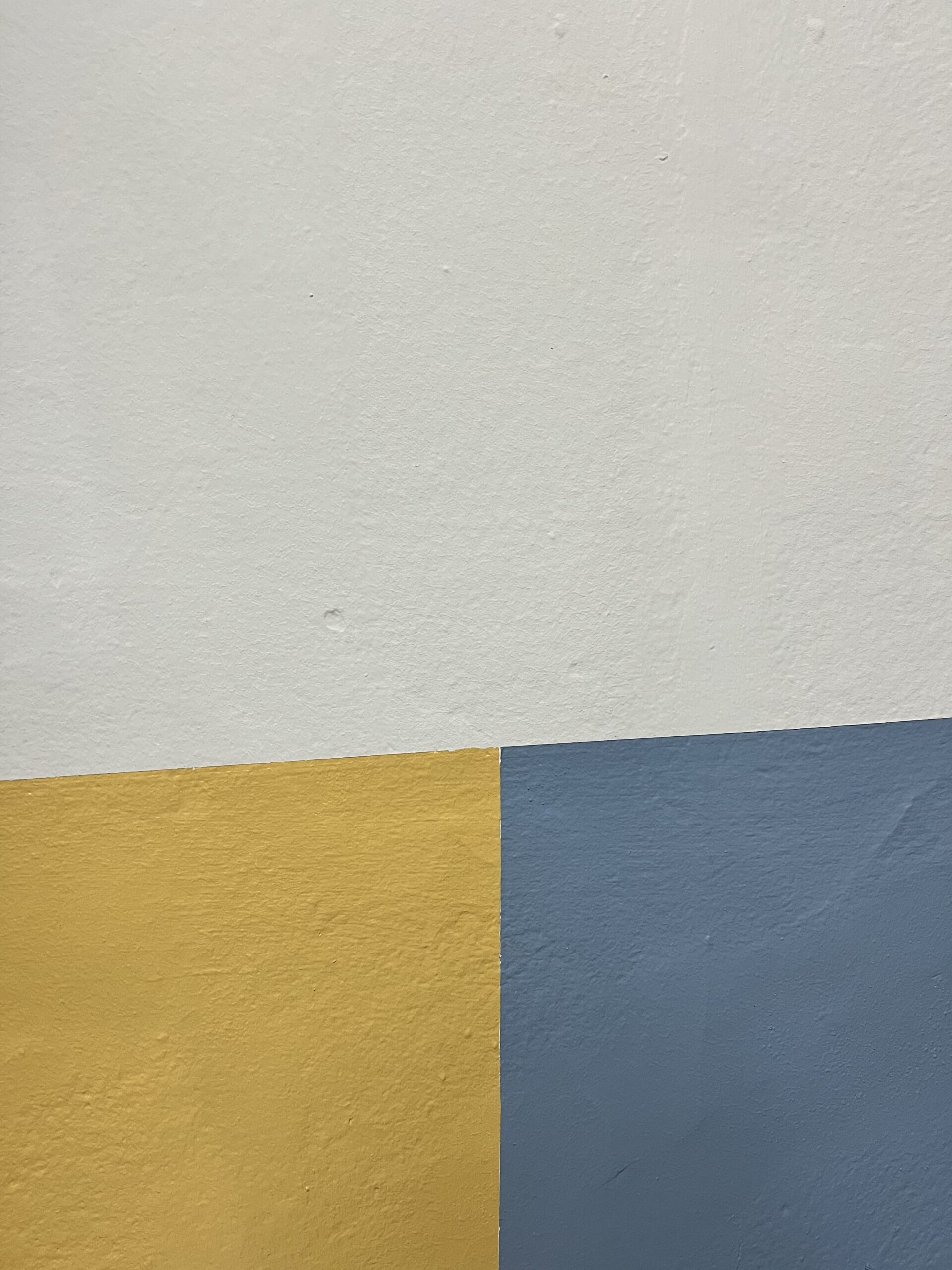
A sharp color line means the boundary between colors stays straight through long walls, corners, columns, and stair slopes. In a school, this line becomes both a visual guide and a finish detail. Knife-sharp color separation is not something that shows only on a long wall; it stands out even more where it wraps around columns, follows the diagonal of the stairs, and meets another color. As on the wall in the photo where the yellow and blue meet, when the boundary is straight, the entire wall looks much more stable.
칼같은 색 나누기는 긴 벽에서만 보이는 것이 아니라 기둥을 돌아가고, 계단 사선을 따라가고, 다른 색과 만나는 부분에서 더 잘 드러납니다. 사진 속 노란색과 파란색이 만나는 벽면처럼 경계가 반듯하면 전체 벽이 훨씬 안정적으로 보여요.
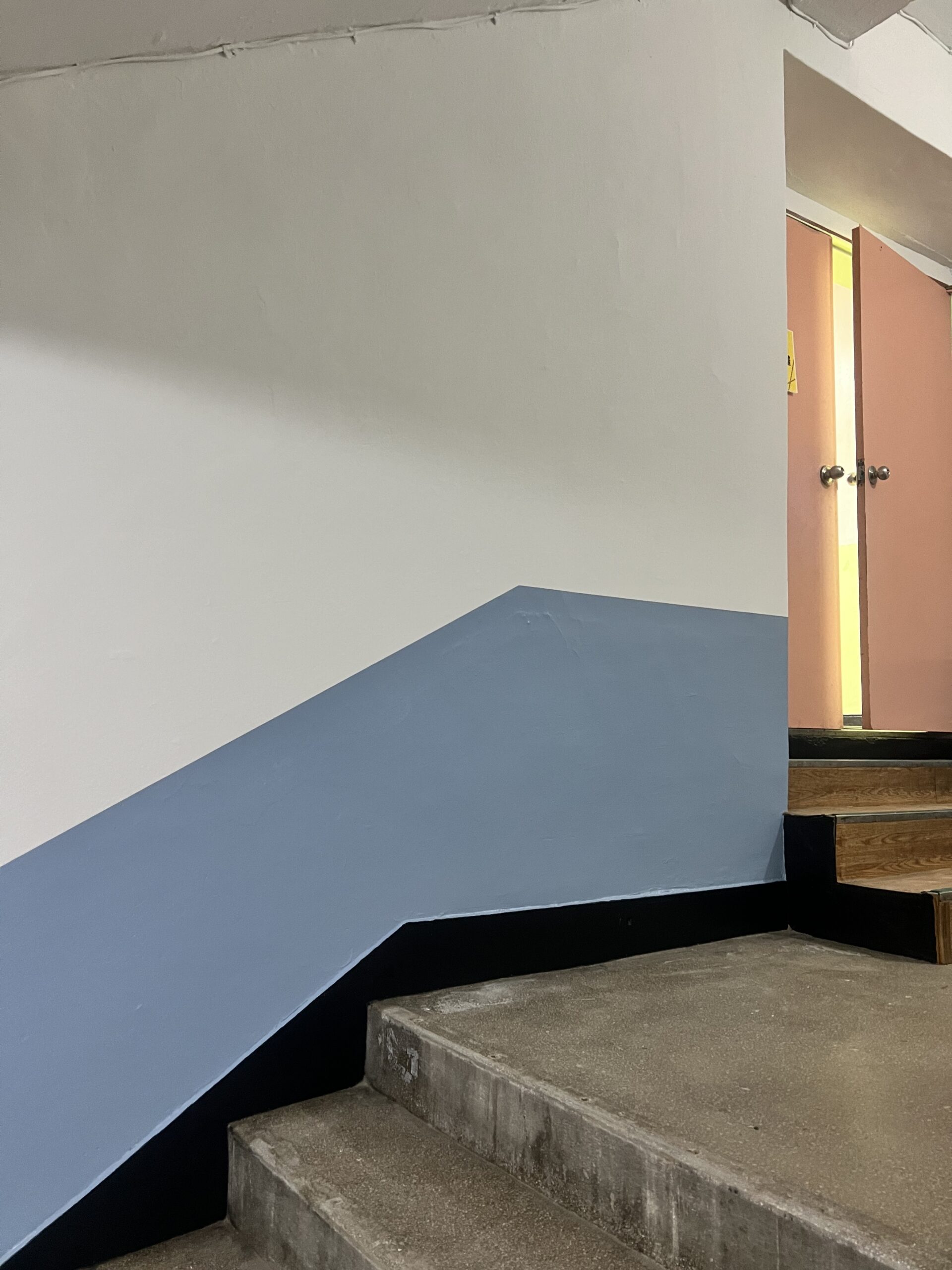
Interior wall paint edge
실내 벽면 페인트 경계
The confusing point on Korean sites is that existing walls are not always perfectly flat like new walls. Even in the photos, the wall surface texture remains visible, so the color boundary can feel different depending on the lighting and viewing angle.
한국 현장에서 헷갈리는 부분은 벽이 늘 새 벽처럼 평평하지 않다는 점입니다. 사진에서도 벽 표면 질감이 살아 있어서 조명과 보는 각도에 따라 색 경계의 느낌이 달라질 수 있습니다. 😅
중학교 복도, 계단 공용부 페인트 주변 풍경
That is why the checking point is simple: look at the line from far away, from the stair landing, and from the side wall. A common area is viewed while people are moving, so the line should not only look good in a close-up photo.
그래서 확인 포인트는 간단합니다. 멀리서, 계단참에서, 그리고 측면 벽에서 선을 보는 것입니다. 공용 공간은 사람들이 이동하면서 보게 되므로, 선은 가까이서 찍은 사진에서만 좋아 보여서는 안 됩니다.
The inspection standard is the actual circulation path, not one close-up photo. The key to painting common areas is checking whether the color line stays steady when seen from the end of the corridor, when looking down from the stair landing, and when viewed beyond the handrail.
확인 기준은 가까운 사진 한 장보다 실제 동선입니다. 복도 끝에서 보았을 때, 계단참에서 내려다볼 때, 난간 너머로 볼 때 색 라인이 흔들리지 않는지 보는 것이 공용부 도장의 핵심입니다.
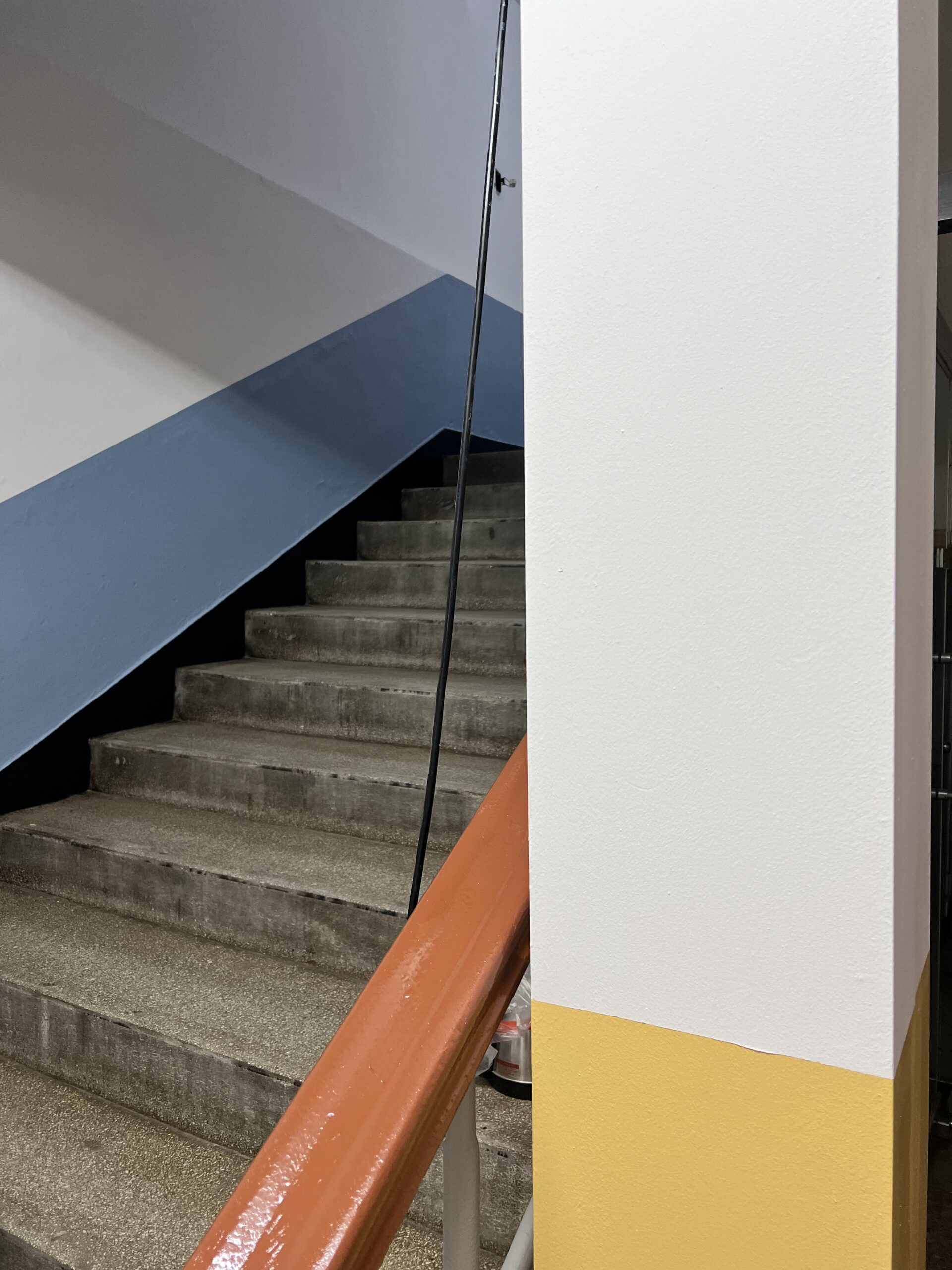
School hallway painted walls
페인트칠된 학교 복도 벽면
Site Details_현장 디테일
The site details shown in the photos are elements often encountered in school common areas. Because exposed pipes, acoustic ceiling panels, concrete stairs, handrails, black lower base lines, and repeated columns are all present together, organizing the colors becomes more important than it would be on a single-color wall.
사진에서 보이는 현장 디테일은 학교 공용부에서 자주 만나는 요소들입니다. 노출 배관, 천장 텍스, 콘크리트 계단, 난간, 검정 하부 라인, 반복되는 기둥이 함께 있기 때문에 단색 벽보다 색 정리가 더 중요해집니다.
School stairwell painted wall
페인트칠이 완료된 학교 계단실 벽
The yellow lower wall creates a bright rhythm in the corridor, while the blue lower wall around the stairs settles calmly between the gray stairs and the black lower base line. Even within the same school, using different colors by zone makes the impression of the circulation space clearer.
노란색 하부는 복도에 밝은 리듬을 만들고, 파란색 하부는 계단 주변의 회색 계단과 검정 하부 라인 사이에서 차분하게 잡아줍니다. 같은 학교 안에서도 구역별로 색을 다르게 쓰면 이동하는 공간의 인상이 분명해집니다.
When using the product, it should be applied within the product guide, without excessive thinning, and each wall should be finished in a way that avoids visible joins. If the paint is diluted too much, coverage drops and marks can remain.
제품을 사용할 때는 제품 가이드 범위 안에서 적용해야 하며, 과도하게 희석하지 않고 각 벽면은 이음 자국이 보이지 않도록 마감해야 합니다. 페인트를 너무 많이 희석하면 은폐력이 떨어지고 자국이 남을 수 있습니다.
When using it, it is best not to dilute it beyond the product standard. If too much water is added, coverage can drop and marks may remain, and caution is needed because tapes left attached for too long before the film has fully dried can pull the paint film off with them.
사용할 때는 제품 기준보다 과하게 희석하지 않는 것이 좋습니다. 물을 많이 타면 은폐가 떨어지고 자국이 남을 수 있으며, 완전히 마르기 전 붙여둔 테이프류를 오래 두면 도막이 같이 뜯길 수 있어 주의가 필요합니다.
The detailed field flow can be checked in Kari Paint’s actual site posts. In this article, we focus only on the middle school corridor and stair painting shown in the photos.
자세한 현장 진행 과정은 카리페인트의 실제 현장 게시물에서 확인할 수 있습니다. 이 글에서는 사진에 나온 중학교 복도와 계단 도장에만 초점을 맞춥니다.
At-a-glance summary_한눈에 정리
First, school common-area paint should be selected not by color alone, but by considering light, substrate, humidity, film, and future repair standards together.
첫째, 학교 공용부 페인트는 색만 보지 말고 빛, 바탕, 습도, 도막, 추후 보수 기준을 같이 봐야 합니다.
Second, sharp color division is best checked from the actual circulation line through the corridors and stairs, especially across corners, columns, and stair slopes, rather than from close-up photos. Third, domestic and imported interior water-based paints each have different strengths in supply, odor, repair, durability, and cost.
둘째, 선명한 색상 구분은 근접 사진보다 복도와 계단을 지나는 실제 동선에서 확인하는 것이 가장 좋으며, 특히 모서리, 기둥, 계단 경사면을 가로지르는 부분에서 중요합니다. 셋째, 국산 및 수입 실내용 수성페인트는 공급, 냄새, 보수, 내구성, 비용 면에서 각각 다른 장점을 가지고 있습니다.
함께 보면 좋은 글
Criteria to Consider When Choosing Samhwa Paint Products on Site
45-Pyeong Apartment in Heuksuk-dong: Minus Molding, Minus Skirting Board, Full Paint, Full Putty Installation
흑석동 45평 아파트, 마이너스 몰딩, 마이너스 걸레받이, 올페인트, 올퍼티 시공
The Atmosphere Changes When Chocolate Color Comes into the House
여러분의 공간을 지금보다 더 가치있게 만드는
카리페인트
망설이지 마시고 문의주세요! ↓↓↓