
Paint in Literature_문학 속 페인트
Hello, this is Kari Paint. Paint in literature is not just a material that covers a wall. It often changes the mood of a room, reveals a character’s desire, or shows the gap between what is hidden and what is seen.
안녕하세요, 카리페인트입니다. 문학 속 페인트는 단순히 벽을 덮는 재료가 아닙니다. 페인트는 종종 방의 분위기를 바꾸고, 인물의 욕망을 드러내며, 숨겨진 것과 보이는 것 사이의 간극을 보여줍니다. 😊
Today, rather than talking about one construction site, I would like to read the paint and colors that appear in novels as symbols. Even the same white, yellow, or green can feel completely different within the light, the substrate, humidity and the paint film, and the story surrounding that color.
오늘은 한 현장 이야기가 아니라, 소설 속에 등장하는 페인트와 색상을 상징으로 읽어보려고 합니다. 같은 흰색, 노란색, 초록색이라도 빛과 바탕, 습도와 도막, 그리고 그 색을 둘러싼 이야기 안에서 전혀 다르게 느껴질 수 있거든요.
White Paint_흰색 페인트
White paint often looks clean on the surface, but in literature it can also carry pressure, order, labor, and even performance. Mark Twain’s The Adventures of Tom Sawyer uses the scene of whitewashing a fence in a way that is still easy to understand today.
흰색 페인트는 겉으로는 깨끗해 보이는 경우가 많지만, 문학에서는 압박감, 질서, 노동, 심지어 연출까지 담아낼 수 있습니다. 마크 트웨인의 『톰 소여의 모험』은 울타리에 흰칠을 하는 장면을 오늘날에도 쉽게 이해할 수 있는 방식으로 활용합니다.
The fence becomes more than a fence because the act of painting changes how others see the work. In real interiors too, white is not simply “safe.” It can make a space look wider, but if the base surface is uneven, it may reveal shadows and joints more clearly.
울타리는 단순한 울타리 이상의 의미를 갖게 됩니다. 페인트칠이라는 행위가 그 일을 바라보는 다른 사람들의 시선을 바꾸기 때문입니다. 실제 실내에서도 흰색은 단순히 ‘무난한’ 색이 아닙니다. 공간을 더 넓어 보이게 만들 수 있지만, 바탕면이 고르지 않으면 그림자와 이음새가 더 또렷하게 드러날 수 있습니다.

White painted fence detail
흰색으로 칠한 울타리의 세부 모습
In Korean apartments, many people choose white or off-white because it works easily with flooring, lighting, and furniture. However, the final impression is influenced more by the condition of the substrate, the direction of light, and how easy the paint film is to maintain in daily life than by the color name itself.
한국 아파트에서는 바닥재, 조명, 가구와 무난하게 어울린다는 이유로 백색이나 미색을 많이 선택합니다. 다만 최종 느낌은 색 이름보다 바탕 상태, 빛의 방향, 그리고 생활하면서 얼마나 관리하기 쉬운 도막인지에 더 크게 영향을 받습니다
Yellow Wall_노란 벽
Yellow is a warm color, but it does not always mean comfort. In Charlotte Perkins Gilman’s The Yellow Wallpaper, the yellow surface creates an uneasy atmosphere rather than a bright one. The color surrounds the character and turns the room into a psychological space.
노란색은 따뜻한 색이지만, 언제나 편안함을 뜻하지는 않습니다. 샬럿 퍼킨스 길먼의 『누런 벽지』에서 노란 표면은 밝은 분위기보다 불안한 분위기를 만들어냅니다. 그 색은 인물을 둘러싸고 방을 심리적인 공간으로 바꿉니다. 😄
This is why color cannot be separated from the room. A yellow tone in a sunny cafe and a yellow tone in a small humid room do not feel the same. In Korea, where summer humidity and condensation can affect walls, yellow or warm colors should be checked with the actual light and surface condition.
그래서 색은 방과 떼어 생각할 수 없습니다. 햇빛이 잘 드는 카페의 노란 톤과 작고 습한 방의 노란 톤은 같은 느낌을 주지 않습니다. 여름철 습기와 결로가 벽에 영향을 줄 수 있는 한국에서는 노란색이나 따뜻한 계열의 색을 실제 빛과 표면 상태에서 확인해야 합니다. 😄
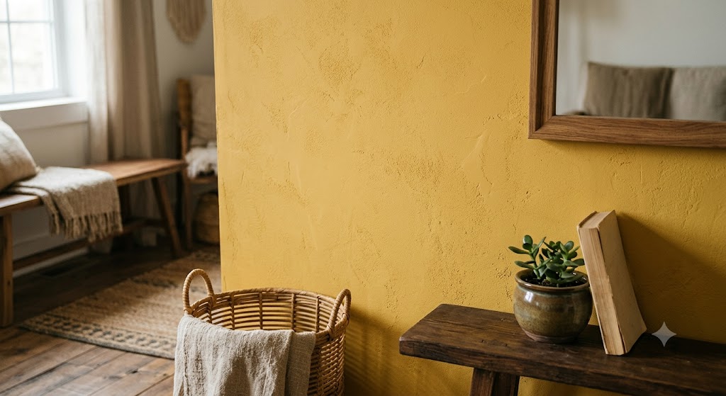
Yellow interior wall texture
노란색 실내 벽 질감
Green Light_초록색의 거리
Color symbolism does not always come from paint itself. In F. Scott Fitzgerald’s The Great Gatsby, the green light is remembered as a color of longing, distance, and desire. It is not a wall finish, but it shows how one color can hold an entire emotion.
색의 상징성이 언제나 페인트 자체에서 나오는 것은 아닙니다. F. 스콧 피츠제럴드의 『위대한 개츠비』에서 초록 불빛은 동경, 거리감, 욕망의 색으로 기억됩니다. 그것은 벽 마감재는 아니지만, 하나의 색이 감정 전체를 담을 수 있음을 보여줍니다.
In interior color planning, green is often connected with calmness or nature, but it can become heavy when the lighting is dim or the surrounding materials are dark. The key is not to ask whether green is good or bad, but to ask what kind of mood the space needs.
실내 색채 계획에서 초록색은 흔히 차분함이나 자연과 연결되지만, 조명이 어둡거나 주변 소재가 어두우면 무겁게 느껴질 수 있습니다. 중요한 것은 초록색이 좋은지 나쁜지를 묻는 것이 아니라, 그 공간에 어떤 분위기가 필요한지를 묻는 것입니다.
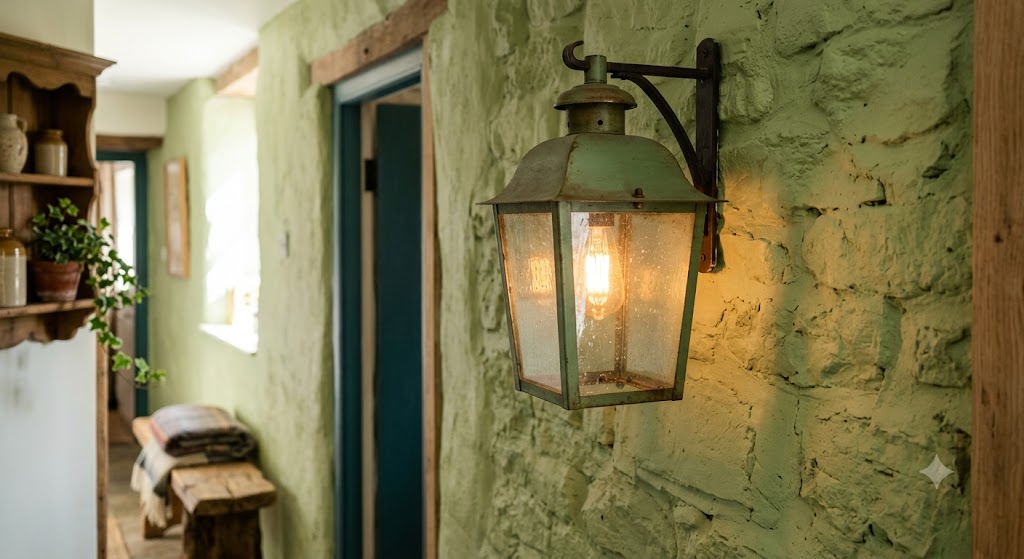
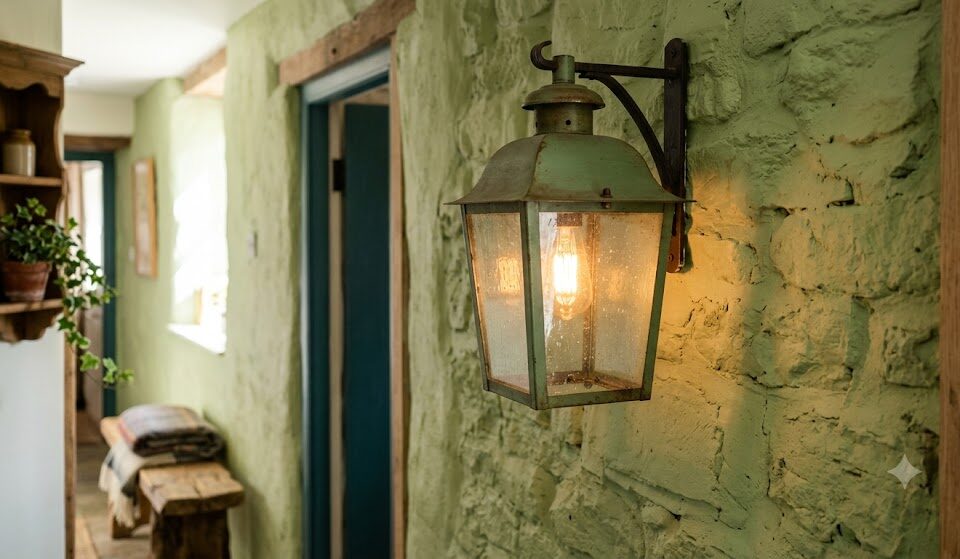
Green painted wall light
초록색으로 칠한 벽의 빛
Color and Surface_색과 바탕
A color in a novel is imagined through words, but a color on a wall is judged through light and surface. Even the same color can look soft on a flat wall and rough on an uneven wall. This is why paint is both a color and a finish.
소설 속 색은 단어를 통해 상상되지만, 벽 위의 색은 빛과 표면을 통해 판단됩니다. 같은 색이라도 평평한 벽에서는 부드럽게 보이고, 고르지 않은 벽에서는 거칠게 보일 수 있습니다. 그래서 페인트는 색이면서 동시에 마감입니다.
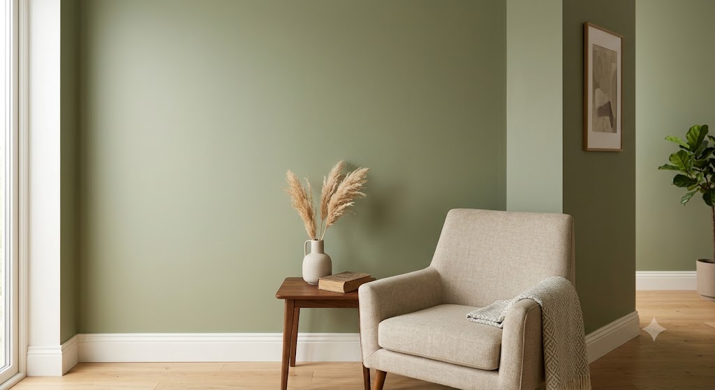
Smooth painted interior wall
매끄럽게 칠해진 실내 벽
Use and Caution_사용과 유의점
The exact work flow should be checked through real Kari Paint project posts. In a color-focused space, the product name alone does not decide the result; the surface, lighting, humidity, and maintenance plan have to be read together.
정확한 작업 흐름은 카리페인트가 실제로 진행한 시공 현장 글을 보시면 더 이해하기 쉽습니다. 색이 중요한 공간일수록 제품 이름만으로 결과가 정해지는 것이 아니라, 바탕면과 조명, 습도, 유지 관리 기준을 함께 읽어야 합니다.
Reading Color_색을 읽는 기준
Literature teaches us that color is never neutral. White can be clean or controlled, yellow can be warm or uneasy, and green can be peaceful or distant. The same thing happens in interior paint.
문학은 색이 결코 중립적이지 않다는 것을 알려줍니다. 흰색은 깨끗하게 느껴질 수도, 통제된 느낌을 줄 수도 있고, 노란색은 따뜻할 수도, 불안하게 느껴질 수도 있으며, 초록색은 평온할 수도, 거리감 있게 느껴질 수도 있습니다. 실내 페인트에서도 같은 일이 일어납니다. 😄
So when choosing paint, it helps to ask a literary question first: what feeling should this room leave behind? After that, the practical questions follow naturally—how much light enters, what the base surface is like, how humid the space is, and how the finish will be maintained.
그래서 페인트를 고를 때는 먼저 문학적인 질문을 던져보는 것이 도움이 됩니다. 이 방은 어떤 느낌을 남겨야 할까요? 그다음에는 실용적인 질문들이 자연스럽게 이어집니다. 빛이 얼마나 들어오는지, 바탕면은 어떤 상태인지, 공간의 습도는 어떤지, 마감은 어떻게 유지관리할 것인지에 대한 질문들입니다.
At a Glance_한눈에 정리
First, paint and color in literature are not merely a decorative background for a space; they are devices that reveal a character’s emotions and desires. Second, actual paint colors look different depending not on the name, but on light, substrate, humidity, film, and upkeep standards.
첫째, 문학 속 페인트와 색상은 공간을 꾸미는 배경이 아니라 인물의 감정과 욕망을 드러내는 장치입니다. 둘째, 실제 페인트 색상은 이름보다 빛, 바탕면, 습도, 도막, 유지 기준에 따라 다르게 보입니다.
Before paint is a material that applies color, it is closer to a language that decides what kind of story a space will leave behind.
페인트는 색을 입히는 재료이기 전에, 공간이 어떤 이야기를 남길지 정하는 언어에 가깝습니다.
함께 보면 좋은 글
Criteria to Consider When Choosing Samhwa Paint Products on Site
45-Pyeong Apartment in Heuksok-dong: Minus Molding, Minus Baseboard, Full Paint, Full Putty Installation
흑석동 45평 아파트, 마이너스 몰딩, 마이너스 걸레받이, 올페인트, 올퍼티 시공
High-Quality Paint vs. Commercial Paint: Which is Better?
여러분의 공간을 지금보다 더 가치있게 만드는
카리페인트
망설이지 마시고 문의주세요! ↓↓↓