

Home Color_집의 컬러
Hello, this is Caripaint. In home design, color is not only one of the first elements that catches the eye, but in reality, it is closer to the atmosphere you continue to feel while staying in a space. 😊
안녕하세요, 카리페인트입니다. 집에서 컬러는 처음 눈에 들어오는 요소이기도 하지만, 사실은 머무는 동안 계속 느끼게 되는 분위기에 더 가깝습니다. 😊
Source: Design Daddy
출처: Design Daddy
Wrong paint colors
잘못된 페인트 색상
A single wall color can make a living room look wider, make a bedroom feel calmer, or make a kitchen appear more organized, depending on its tone and the light.
벽 색 하나가 거실을 넓어 보이게 하기도 하고, 침실을 차분하게 만들기도 하며, 주방을 더 정돈된 느낌으로 보여주기도 합니다.
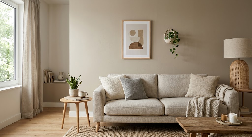
Neutral living room wall
뉴트럴 톤 거실 벽
Warm Tones_따뜻한 톤
Warm colors such as beige, cream, soft terracotta, and gentle peach tones make a space feel a little closer and give it a comfortable impression. These tones work well in rooms where people gather, such as living rooms and dining areas. However, if they are used too strongly over a large area, the space can feel stuffy, so it is more balanced to keep large walls soft and add deeper colors through cushions or furniture.
베이지, 크림, 연한 테라코타, 부드러운 피치 계열은 공간을 조금 더 가까운 느낌으로 만들고 편안한 인상을 줍니다. 이러한 색조(톤)는 거실이나 식당처럼 사람들이 모이는 방에 잘 어울립니다. 다만 넓은 면적에 너무 진하게 들어가면 답답해 보일 수 있어서, 큰 벽은 부드럽게 잡고 쿠션이나 가구에서 깊은 색을 더하는 편이 안정적입니다.
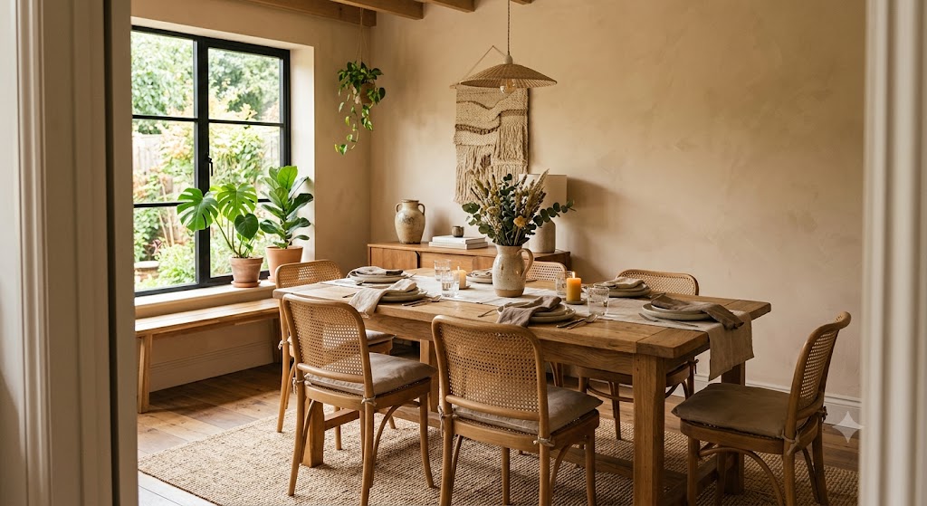
Warm beige dining room
따뜻한 베이지 톤 다이닝룸
Cool Tones_차가운 톤
Cool colors such as blue gray, pale green, and toned-down navy are well suited to creating a calm and organized mood.
블루그레이, 연한 그린, 톤다운된 네이비는 차분하고 정리된 분위기를 만드는 데 잘 어울립니다.
A cool color does not always mean the space will feel cold. When used together with wood flooring, fabric curtains, and warm lighting, it can instead create a quiet, deep atmosphere at home. 😄
차가운 색이라고 해서 공간이 무조건 차갑게 느껴지는 것은 아니에요. 우드 바닥, 패브릭 커튼, 따뜻한 조명과 함께 쓰면 오히려 조용하고 깊이 있는 집 분위기가 만들어집니다. 😄
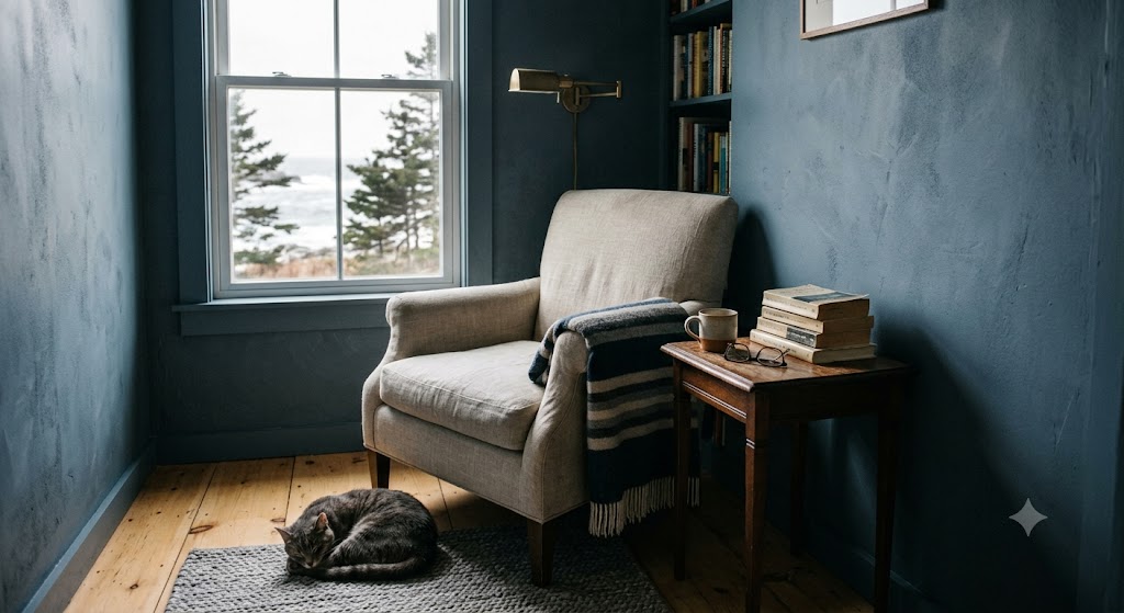
Blue gray bedroom wall
블루 그레이 침실 벽
Neutral colors are often chosen because they allow people to live comfortably in a space for a long time. These colors help reduce visual fatigue and have the advantage of blending naturally even when furniture or decorative items change.
중립적인 색상은 종종 사람들이 오랜 시간 동안 편안하게 살아갈 수 있도록 선택됩니다. 이러한 색상은 피로감을 덜 느끼게 하며, 가구나 소품이 바뀌어도 자연스럽게 어울리는 장점이 있습니다 Neutral colors are often chosen because they are easy to live with for a long time. 뉴트럴 컬러는 오래 봐도 피로감이 적고, 가구나 소품이 바뀌어도 비교적 자연스럽게 어울린다는 장점이 있습니다.
But neutral does not mean colorless. Even with the same white, a yellow undertone can make it feel warmer, while a gray undertone can give a more refined impression, so it is best to check samples again under the actual lighting.
하지만 뉴트럴이 곧 무채색이라는 뜻은 아닙니다. 같은 화이트라도 노란 기가 있으면 포근해 보이고, 회색 기가 있으면 더 정제된 느낌을 주기 때문에 샘플은 조명 아래에서 꼭 다시 보는 것이 좋습니다.
Source: Fact Pact
출처: Fact Pact
Color psychology tips
색채 심리학 팁
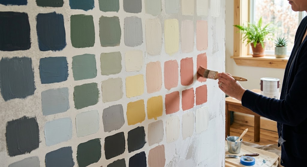
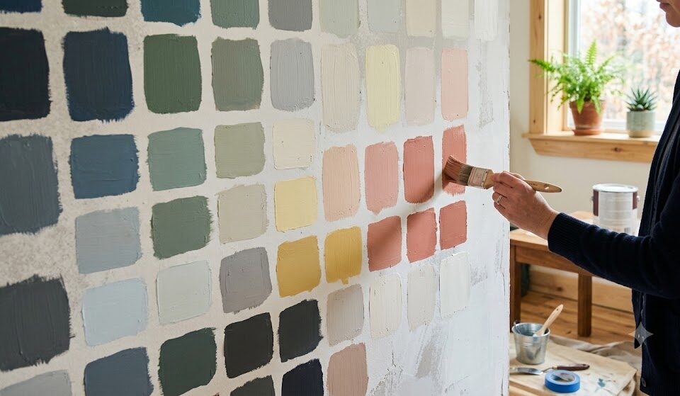
Paint color samples wall
페인트 컬러 샘플 벽
Light and Surface_빛과 표면
Color psychology changes when the light and surface condition change. It is not determined by the color name alone, but also by the light and the condition of the wall surface. Even if you choose the same color chip, it can look completely different in a bright south-facing room and in a room with low illumination.
컬러 심리는 색 이름만으로 결정되지 않고, 빛과 벽면 상태에 따라서도 달라집니다. 같은 컬러칩을 골라도 남향의 밝은 방과 조도가 낮은 방에서는 전혀 다른 표정으로 보일 수 있어요.
The smoother the wall surface is, the cleaner the color looks, especially with soft matte finishes. In particular, matte and low-sheen finishes can be sensitive to uneven wall surfaces, putty marks, and lighting shadows. That is why preparing an even base is just as important as choosing the right color.
특히 무광이나 저광 계열은 벽면의 굴곡, 퍼티 자국, 조명 그림자에 민감할 수 있습니다. 그래서 컬러를 잘 고르는 것만큼 바탕을 고르게 잡는 과정도 중요합니다.
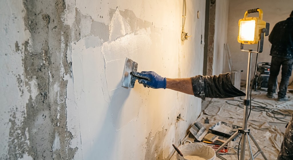
Wall putty work light
작업등 아래 벽 퍼티 작업
Room Mood: Mood by Space_공간별 분위기
For a bedroom, many people often feel most comfortable with colors that lower visual tension, such as warm white, greige, or soft blue gray.
침실은 시각적인 긴장을 낮춰주는 웜화이트, 그레이지, 부드러운 블루그레이 계열이 편안하게 느껴질 때가 많습니다.
For a study or home office, a slightly muted color can feel more comfortable for concentration than a color that is too vivid. In the kitchen or entryway, colors that give a bright and clean impression can make the first feeling of the space lighter.
서재나 작업방은 너무 선명한 색보다 한 톤 눌린 색이 집중감에는 더 편할 수 있습니다. 주방이나 현관은 밝고 깨끗한 인상을 주는 컬러가 첫 느낌을 가볍게 만들어주고요.
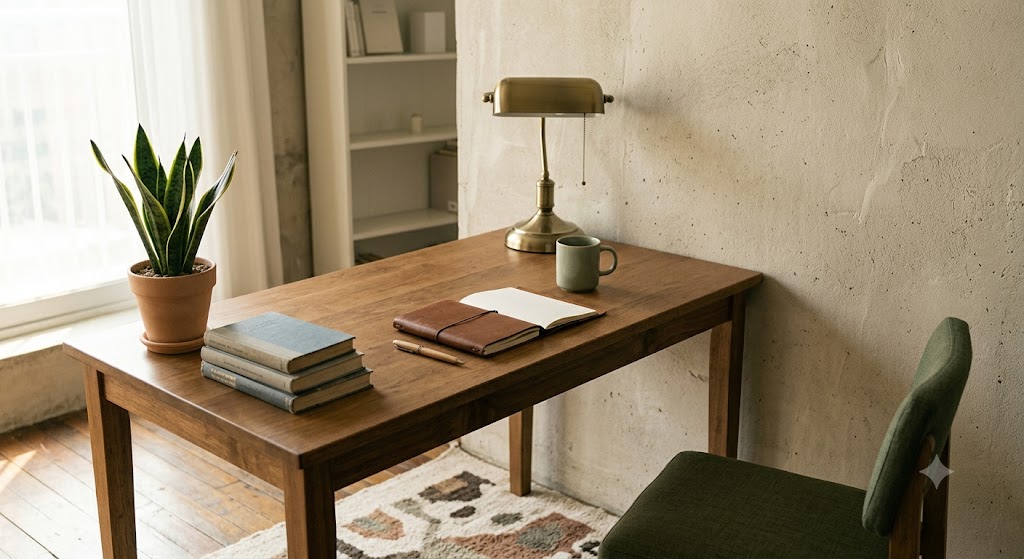
Muted home office wall
차분한 톤의 홈 오피스 벽
Final Scene_마지막 장면
Choosing a wall color does not end with choosing a color that looks pretty today. It is closer to choosing what kind of morning you want to meet in that room, and what kind of expression you want to rest with in the evening.
벽 컬러를 고르는 일은 오늘 예쁜 색을 고르는 것에서 끝나지 않습니다. 그 방에서 어떤 아침을 맞고 싶은지, 저녁에는 어떤 표정으로 쉬고 싶은지를 함께 고르는 일에 가깝습니다.
When the right color meets the right light, a home changes its mood without saying a word. The scene where your heart gently relaxes as you open the door and step inside—in fact, a good color stays with you longer in moments like that. 😉
잘 맞는 색과 빛이 만나면 집은 말없이도 분위기를 바꿉니다. 문을 열고 들어왔을 때 살짝 마음이 풀리는 장면, 사실 좋은 컬러는 그런 순간에 더 오래 남습니다. 😉
함께 보면 좋은 글
Interior Color Psychology: How Color Changes the Mood of a Space
Paint Home Interior: Transform the Mood by Painting Only Doors, Moldings, and the Veranda
도어, 몰딩, 베란다만 칠해도 분위기가 바뀌는 페인트 홈 인테리어!
[Support] Red Color and Vintage Stucco Accents at Jokbal Factory (feat. Neon Lighting)
[Support] 레드컬러와 빈티지스타코 포인트, 족발팩토리(feat. 네온 조명)
여러분의 공간을 지금보다 더 가치있게 만드는
카리페인트
망설이지 마시고 문의주세요! ↓↓↓