

For this eyeglass shop project in Geomdan, we brought out texture on the walls with an ivory-toned Granule finish and kept the ceiling calm with an ultra-matte white finish. Since lighting and display are important in an eyewear store, the walls and ceiling need to support the products rather than stand out too much. 🏠
검단 안경점 현장 이번 현장은 벽은 그레뉼 아이보리 계열로 질감을 살리고, 천정은 극무광 백색 계열로 차분하게 정리한 공간입니다. 안경점은 조명과 진열이 중요한 곳이라 벽과 천정이 너무 튀기보다 상품을 받쳐주는 느낌이 중요하거든요. 🏠
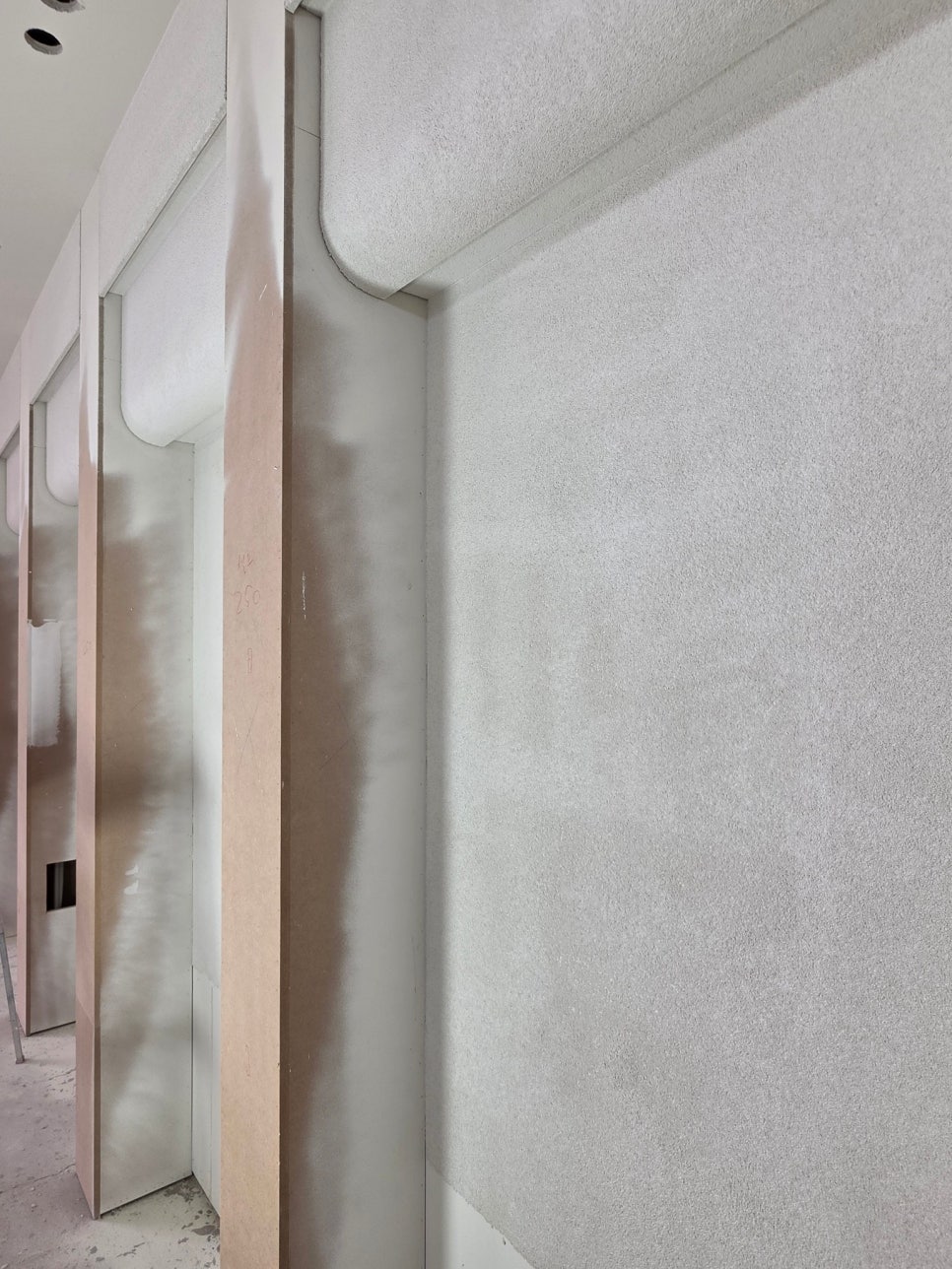
You can see the subtle particles. This is not a finish that ends up smooth like ordinary water-based paint, but a Granule-type finish where the surface texture comes alive when viewed up close. Ivory tones are easy to use in commercial spaces. Pure white can feel cold, and darker colors can make a space feel smaller, but when the mid-tone is chosen well, it creates an atmosphere that feels warm yet neatly organized.
잔잔한 입자가 보이죠. 일반 수성페인트처럼 매끈하게만 끝나는 마감이 아니라, 가까이 봤을 때 표면감이 살아나는 그레뉼 계열 마감이에요. 아이보리 계열은 상공간에서 부담이 적습니다. 너무 흰색이면 차갑게 보일 수 있고, 너무 진하면 공간이 좁아 보일 수 있는데 중간 톤을 잘 잡으면 따뜻하면서도 정돈된 분위기가 나와요.
https://terraco.co.kr/%ED%85%8C%EB%9D%BC%EC%BD%94%ED%8A%B8-%EA%B7%B8%EB%9E%98%EB%89%BC
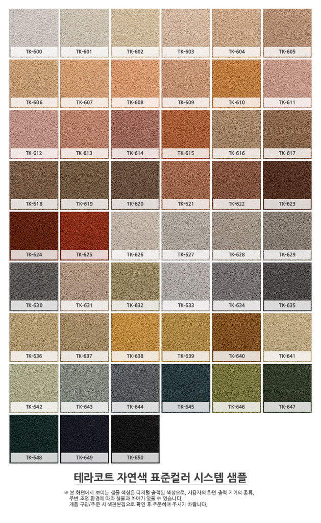
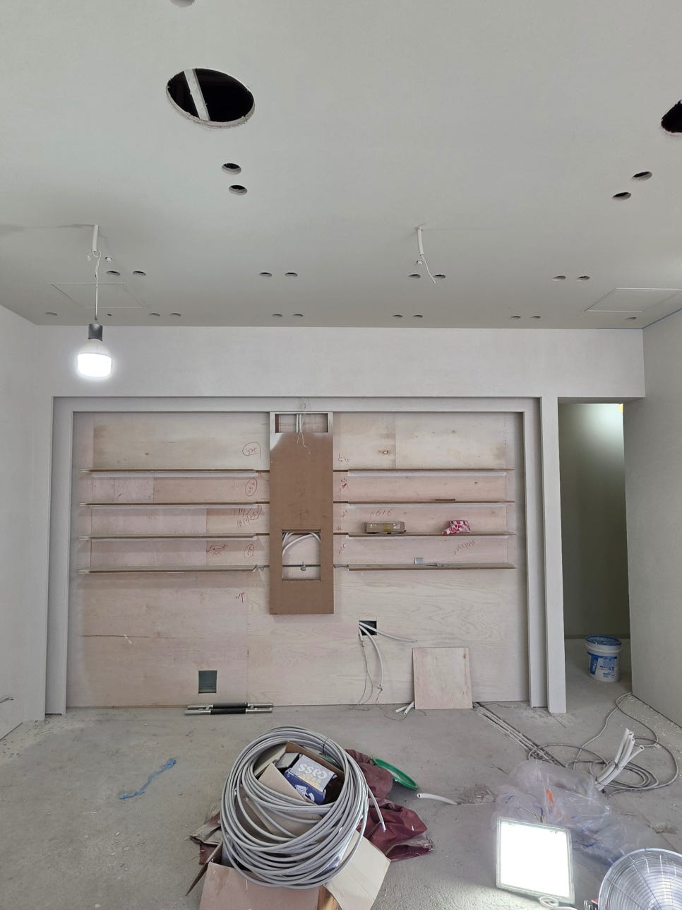
Especially in a place like an eyeglass shop, where lenses, frames, mirrors, and lighting all come together, the wall texture quietly sets the mood. It has detail when seen up close, and from a distance it becomes a background that does not feel excessive.
특히 안경점처럼 렌즈, 프레임, 거울, 조명이 같이 들어가는 곳은 벽 질감이 은근히 분위기를 잡아줍니다. 가까이 보면 디테일이 있고, 멀리서 보면 과하지 않게 배경이 되어주는 마감이죠. 😉
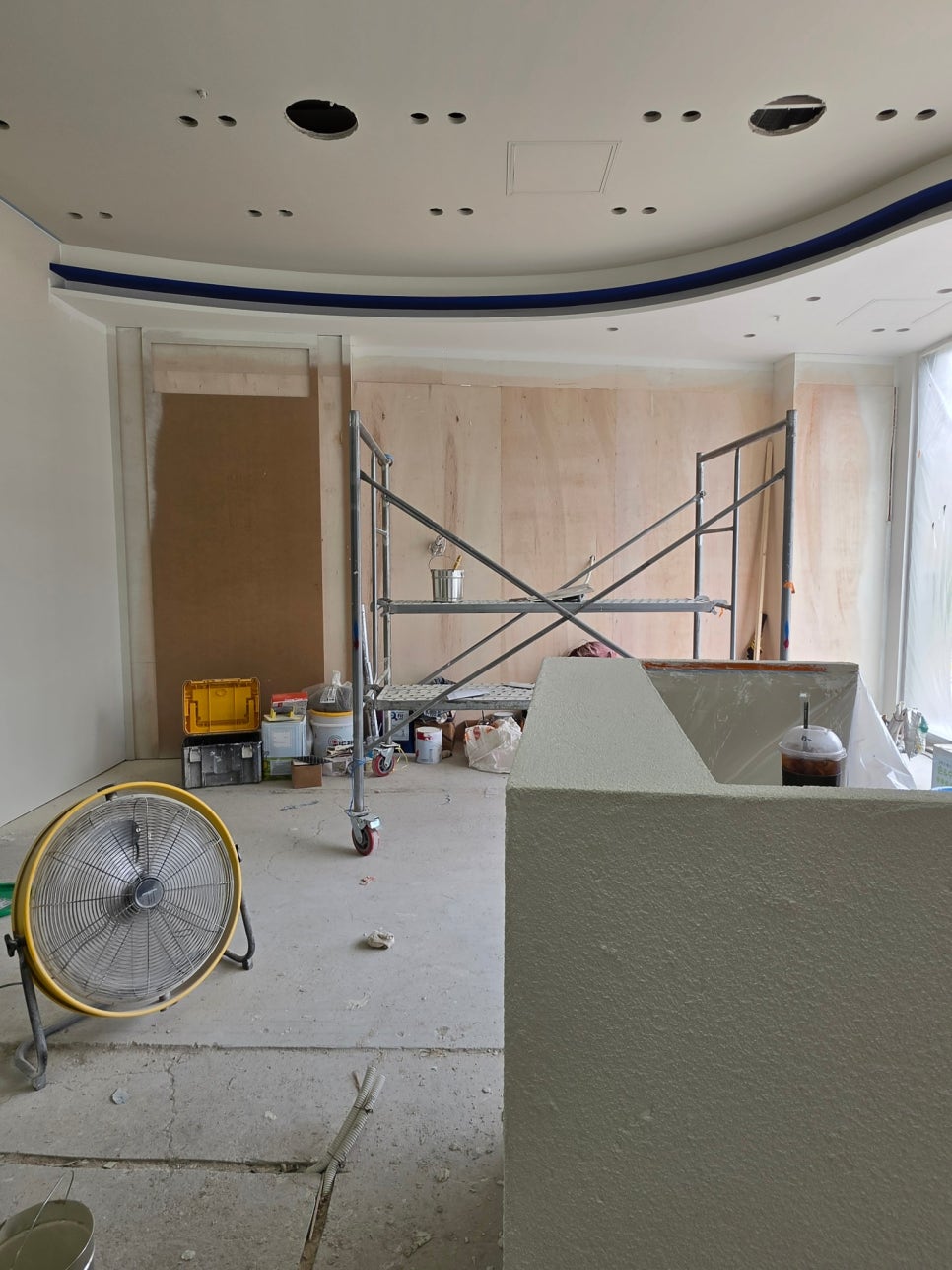
Full Putty Surface Preparation_올퍼티 바탕 정리
This project also included a full putty finish. In commercial spaces, there is a lot of lighting, and ceiling openings, wall lines, and the areas around display fixtures are easy to notice, so preparing the base surface is even more important. On this site, the putty work was carried out with precision. If the putty is done roughly, level differences and uneven surfaces become much more visible under the lighting after completion. That is why it is essential to spend time shaping the surfaces and cleaning up the corners and entrance lines before painting.
이번 현장은 올퍼티 마감이 함께 들어갔습니다. 상공간은 조명이 많고 천정 타공, 벽체 라인, 진열장 주변이 눈에 잘 들어오기 때문에 바탕 정리가 더 중요해요. 이번 현장에서는 퍼티 작업이 정밀하게 진행되었습니다. 퍼티를 대충 잡으면 완성 후에는 조명 아래에서 단차나 면이 더 잘 보입니다. 그래서 칠하기 전 단계에서 면을 잡고, 모서리와 입구 라인을 정리하는 시간이 꼭 필요합니다.
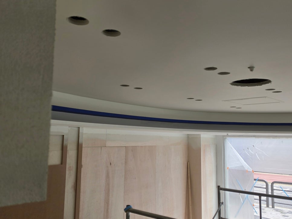
For the ceiling, we used an ultra-matte white finish. Store ceilings often have many recessed light openings and wiring spots, so a calm matte finish makes the space look more stable than a highly reflective finish. Ultra-matte finishes reduce the sense of light glare, so they are often chosen for commercial spaces with a lot of lighting. Of course, if the base surface is uneven, marks can still show even with a matte finish, so the ceiling also needs proper surface preparation for a good result.
천정 극무광 백색 천정은 극무광 백색 계열로 진행했습니다. 매장 천정에는 매입등 타공과 배선 자리들이 많아서 반사가 강한 마감보다 차분한 무광 계열이 공간을 안정적으로 보여줘요. 극무광은 빛 번짐이 덜 느껴져서 조명이 많은 상공간에서 많이 찾는 편입니다. 물론 바탕이 고르지 않으면 무광이어도 흔적은 보일 수 있어서, 천정도 면 정리가 함께 가야 결과가 좋습니다.

Blue Accent Line_파란색 포인트 라인
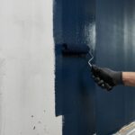
Below the ceiling, we added a blue-toned water-based ultra-matte accent line. Rather than filling the whole space with a strong color, it draws the eye with a thin line. When color is applied along a curved line as shown in the photos, the space looks a little more defined. For an eyewear store, it becomes an accent area that can express the brand atmosphere while still maintaining a clean impression.
천정 아래로는 파란색 계열 수성 극무광 포인트 라인이 들어갔어요. 전체를 강한 색으로 채우는 방식이 아니라, 얇은 라인으로 시선을 잡아주는 방식입니다. 사진처럼 곡선 라인을 따라 색이 들어가면 공간이 조금 더 또렷해 보입니다. 안경점이라는 업종 특성상 깨끗한 인상은 유지하면서도, 브랜드 분위기를 줄 수 있는 포인트가 되는 구간이에요.

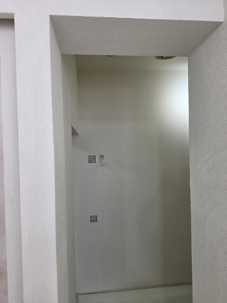
The exam room was finished separately in white. Since the exam room is a functional area within the store, it is better for the walls not to look too busy. Finishing it in white makes even a small space feel less cramped and makes the equipment and outlet locations look neatly organized. The overall quality improves when visible areas such as the inside of the door frame, the area below the ceiling, and the wall corners are all finished consistently.
검안실은 백색으로 별도 마감이 들어갔습니다. 검안실은 매장 안에서도 기능적인 공간이라 벽이 너무 복잡하게 보이지 않는 게 좋아요. 백색 계열로 정리하면 작은 공간도 답답함이 덜하고, 장비나 콘센트 위치도 깔끔하게 정돈되어 보입니다. 문틀 안쪽, 천정 아래, 벽 모서리처럼 시선이 닿는 부분을 같이 맞춰야 완성도가 올라가더라구요. 😄
Commercial Space Finishing Standards_상공간 마감 기준
Painting a commercial space is not just about choosing pretty colors. You need to consider what kind of lighting will be installed, how far the display fixtures will extend, and which walls customers will see first as they move through the space. As in this Geomdan eyeglass shop project, when an ivory Granule wall finish, an ultra-matte white ceiling, and a blue accent line are used together, each part of the space has its own role. The walls feel warm, the ceiling looks clean, and the line stands out clearly.
상공간 페인트는 예쁜 색만 고르면 끝나는 작업이 아닙니다. 어떤 조명이 들어오는지, 진열장이 어디까지 붙는지, 손님 동선에서 어떤 벽이 먼저 보이는지까지 같이 봐야 해요. 이번 검단 안경점 현장처럼 그레뉼 아이보리 벽마감, 극무광 백색 천정, 파란색 포인트 라인이 함께 들어가면 공간의 역할이 나뉩니다. 벽은 따뜻하게, 천정은 깨끗하게, 라인은 선명하게 잡히는 구성이죠. 😄
Finishing is what you see at the very end, but in reality, it is determined from the initial base work. If you are preparing a commercial space, thinking about the condition of the walls, the lighting, and the finish texture before choosing the color can help create a much more natural result.
마감은 마지막에 보이는 일이지만, 사실은 처음 바탕부터 결정됩니다. 상공간을 준비하신다면 색상보다 먼저 벽 상태와 조명, 마감 질감을 함께 생각해보시면 훨씬 자연스러운 결과를 만들 수 있습니다.
함께 보면 좋은 글
Why do those who know a bit about interior design insist on ‘paint’?
인테리어 좀 아는 사람들은 왜 ‘페인트’를 고집할까요?
Why do those who do some interior design choose Benjamin Moore?
Nomore Pizza Gwangmyeong Interior Paint Construction|Granolastaco with Pantone Orange Finish 🍕
노모어피자 광명점 인테리어 페인트 시공|그레뉼스타코에 팬톤 오렌지 마감 🍕
여러분의 공간을 지금보다 더 가치있게 만드는
카리페인트
망설이지 마시고 문의주세요! ↓↓↓