High-End vs. Standard Paint Finishes: Differences to Check Before Photos | 고급 마감과 일반 마감, 사진보다 먼저 봐야 할 차이

Difference_하이엔드 마감 차이
Hello, this is Kari Paint. When looking at interior photos, there are times when the colors are similar, yet one space feels especially luxurious while another feels a little ordinary. That difference is not created simply by one expensive material, but by the completeness of the finish, from the substrate and light to the paint film and upkeep.
안녕하세요, 카리페인트입니다. 인테리어 사진을 보다 보면 색상은 비슷한데 어떤 공간은 유난히 고급스럽고, 어떤 공간은 조금 평범하게 느껴질 때가 있습니다. 그 차이는 단순히 비싼 자재 하나로 생기는 것이 아니라, 바탕과 빛, 도막과 유지까지 이어지는 마감의 완성도에서 만들어집니다. 😊
High-end finishing is not only about painting a wall cleanly. It is closer to a finish that allows the wall, ceiling, molding lines, and the flow of surfaces seen under lighting to connect as one space, with fewer visual interruptions.
하이엔드 마감은 벽을 깨끗하게 칠하는 것만을 의미하지 않습니다. 벽과 천장, 몰딩 라인, 조명 아래에서 보이는 면의 흐름이 하나의 공간처럼 이어지게 만드는 마감에 가깝습니다.
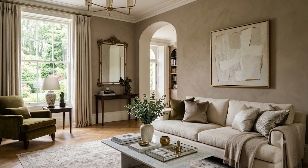
Luxury living room painted wall
고급스러운 거실 도장 벽면
Surface Quality_바탕의 완성도
The biggest difference between a general finish and a high-end finish usually begins with the substrate before the final color is applied. When the surface is even, the same paint looks calmer; when the surface is uneven, small level differences or shadows become easier to see under light.
일반 마감과 고급 마감의 가장 큰 차이는 마지막 색상이 올라가기 전 바탕에서 시작됩니다. 면이 고르면 같은 페인트도 차분하게 보이고, 면이 울퉁불퉁하면 빛을 받을 때 작은 단차나 그림자가 더 쉽게 드러납니다.
In Korean residential spaces, many people are accustomed to wallpaper finishes, so paint is sometimes judged mainly by color. However, because paint is a finish that exposes the wall surface itself, the existing wall condition and the quality of the putty work have a more direct effect on the final result.
한국 주거 공간은 도배 마감에 익숙한 경우가 많아서 페인트를 색상 중심으로만 보는 경우가 있습니다. 하지만 페인트는 벽면 자체가 그대로 드러나는 마감이기 때문에, 기존 벽 상태와 퍼티 면의 완성도가 결과에 더 직접적으로 영향을 줍니다.
The standard to check is not simply whether it has been painted white. You should also look at whether the surface appears even from the side, whether joints or level differences stand out under lighting, and whether the line where the ceiling and wall meet looks natural.
확인할 기준은 단순히 하얗게 칠해졌는지가 아닙니다. 옆에서 봤을 때 면이 고르게 보이는지, 조명 아래에서 이음이나 단차가 도드라지지 않는지, 천장과 벽이 만나는 선이 자연스러운지를 함께 봐야 합니다.
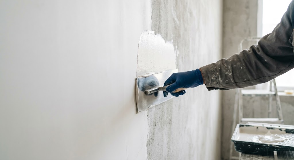
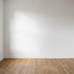
Smooth wall putty surface
매끄러운 벽을 위해 퍼티 진행
Light and Shadow_빛과 그림자
Luxury finishes show their differences more clearly when they receive light. Even the same color can look soft, feel heavy, or reveal surface movement more noticeably depending on daylight, indirect lighting, and the sheen level of the paint.
고급 마감은 빛을 받았을 때 차이가 더 분명해집니다. 같은 색이라도 자연광, 간접조명, 페인트 광도에 따라 부드럽게 보이기도 하고, 무겁게 보이기도 하며, 면의 흔들림이 더 잘 보이기도 합니다.
Matte finishes can make a space look calm, but on walls that are touched often, maintainability must be considered as well. By contrast, finishes with gloss or washability have practical advantages, but if the surface is not even, level differences can become more visible.
무광 계열은 공간을 차분하게 보이게 만들 수 있지만, 손이 자주 닿는 벽체에서는 유지 관리도 함께 봐야 합니다. 반대로 광택이나 세척성을 가진 마감은 실용적인 장점이 있지만, 면이 고르지 않으면 단차가 더 잘 보일 수 있습니다.
This is where many people get confused in Korean apartments. A color sample may look beautiful under store lighting, but the same color can feel different in a south-facing living room, a darker hallway, or a room with strong ceiling lighting.
한국 아파트에서는 이 지점에서 많은 분들이 헷갈려 합니다. 매장 조명 아래에서는 컬러 샘플이 아름다워 보일 수 있지만, 같은 색상도 남향 거실, 어두운 복도, 천장 조명이 강한 방에서는 다르게 느껴질 수 있습니다. 😅
This is also where people get confused in Korean apartments. A color that looked pretty on a small color chip can feel different in a south-facing living room, a dark hallway, or a room with strong ceiling lighting. That is why, for a high-end finish, it is better to consider the direction of light together with the color choice.
한국 아파트에서 헷갈리는 부분도 여기에 있습니다. 작은 컬러칩에서는 예뻐 보였던 색이 남향 거실, 어두운 복도, 천장 조명이 강한 방에서는 다르게 느껴질 수 있습니다. 그래서 하이엔드 마감은 색상 선택과 함께 빛의 방향까지 같이 보는 것이 좋습니다. 😅
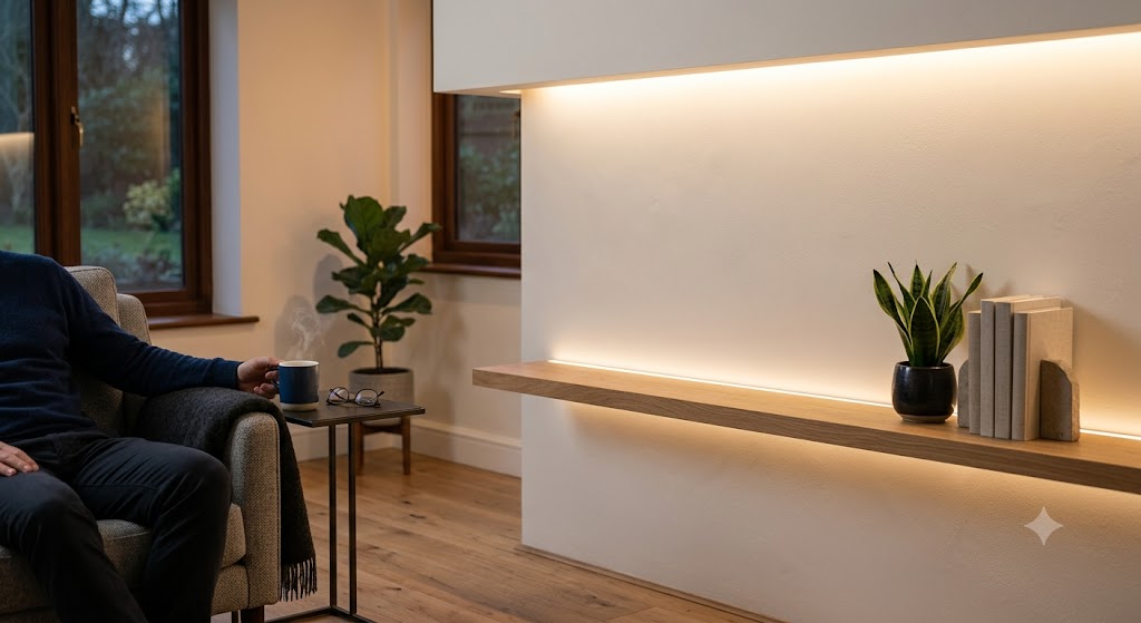
Matte wall indirect lighting
간접조명이 비추는 무광 벽면
Material and Film_도막의 차이
A general finish focuses on covering the surface neatly within a reasonable range. A high-end finish goes further by considering the evenness of the paint film, resistance to hand marks, stability of sheen, and the maintained condition after time has passed.
일반 마감은 합리적인 범위 안에서 표면을 깔끔하게 덮는 데 초점이 있습니다. 하이엔드 마감은 여기서 더 나아가 도막의 균일함, 손때에 대한 저항성, 광도의 안정감, 시간이 지난 뒤의 유지 상태까지 함께 봅니다.
There is no single paint that is always right for every space. A ceiling, a hallway wall, a reception area in a commercial space, and a child’s room all require different criteria because the amount of touch, humidity, and cleaning method are different.
모든 공간에 항상 맞는 페인트가 하나로 정해져 있는 것은 아닙니다. 천장, 복도 벽, 상공간의 리셉션, 아이가 사용하는 방은 손이 닿는 정도와 습도, 청소 방식이 다르기 때문에 판단 기준도 달라져야 합니다.
Imported brands such as Benjamin Moore and Dunn-Edwards are often discussed when people talk about premium paint, but domestic brands such as Samhwa Paint, Noroo Paint, KCC Paint, and Chokwang Paint are also important on Korean sites because supply, tinting, scheduling, and after-service are practical factors.
벤자민 무어, 던에드워즈와 같은 수입 브랜드는 프리미엄 페인트를 이야기할 때 자주 언급되지만, 국내 현장에서는 삼화페인트, 노루페인트, KCC페인트, 조광페인트 같은 국내 브랜드도 중요합니다. 공급, 조색, 일정 조율, 사후 서비스가 실제적인 요소이기 때문입니다.
Imported brands such as Benjamin Moore and Dunn-Edwards are often mentioned when discussing premium paint, but on Korean job sites, brands such as Samhwa Paint, Noroo Paint, KCC Paint, and Chokwang Paint also need to be compared together. In an actual estimate, material supply, color matching, schedule coordination, after-service response, and on-site workability all affect the final result.
수입 브랜드인 벤자민무어(Benjamin Moore), 던에드워드(Dunn-Edwards)는 프리미엄 페인트를 이야기할 때 자주 언급되지만, 국내 현장에서는 삼화페인트, 노루페인트, KCC페인트, 조광페인트 같은 브랜드도 함께 비교해야 합니다. 실제 견적에서는 자재 수급, 색 맞춤, 일정 조율, A/S 대응, 현장 작업성이 모두 결과에 영향을 주기 때문입니다.
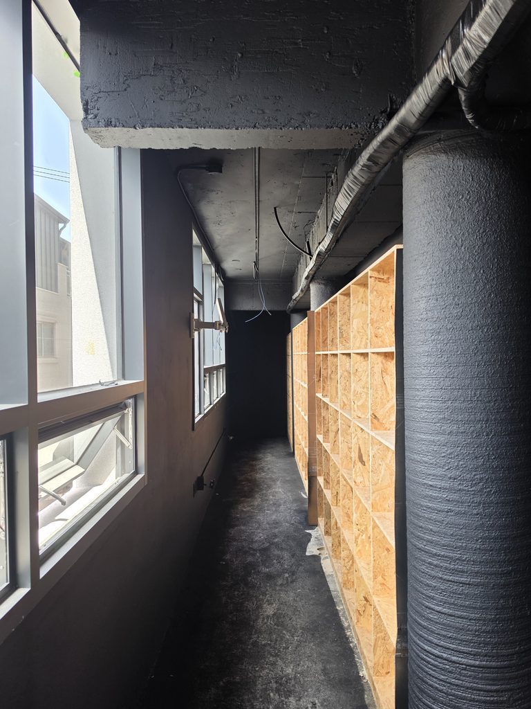
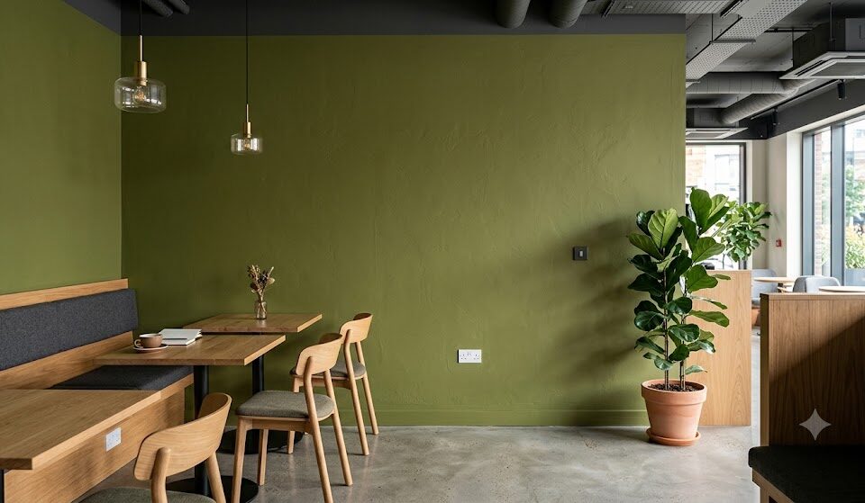
Commercial interior painted wall
상업 공간 인테리어 도장 벽면
General Finish_일반 마감
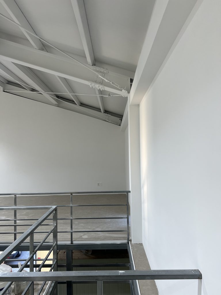
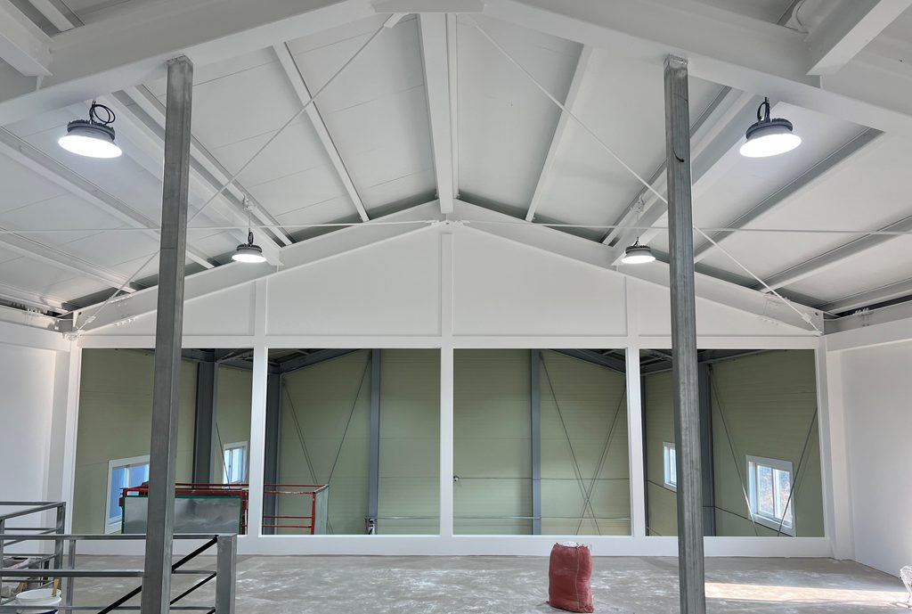
A general finish is not a bad finish. It is a practical finish that balances the budget, schedule, and the level of completion needed for the purpose of the space.
일반 마감은 낮은 수준의 마감이라는 뜻이 아닙니다. 예산과 일정, 공간의 목적에 맞춰 필요한 만큼의 완성도를 맞추는 실용적인 마감입니다.
For example, rental spaces, storage rooms, temporary offices, or spaces where furniture covers much of the wall may not need the same level of surface preparation as a high-end residential living room. In these cases, a general finish suited to the purpose can be the more realistic choice.
예를 들어 임대 공간, 창고, 임시 사무실, 가구가 벽을 많이 가리는 공간은 고급 주거 거실과 같은 수준의 면 정리가 꼭 필요하지 않을 수 있습니다. 이런 경우에는 목적에 맞는 일반 마감이 오히려 더 현실적인 선택이 됩니다.
However, a general finish does not mean the work can be done carelessly. Basic adhesion, color coverage, sheen appropriate for the space, and the ability to maintain the finish in everyday use are still criteria that need to be checked.
마감해도 된다는 뜻은 아닙니다. 기본적인 부착, 색상 커버, 공간에 맞는 광도, 생활 속 유지 가능성은 여전히 확인해야 할 기준입니다.
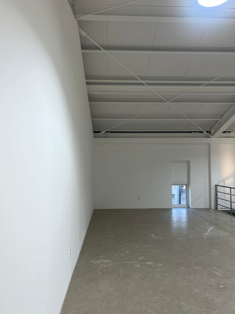
Simple interior painted wall
심플한 인테리어 도장 벽면
High-End Finish_하이엔드 마감
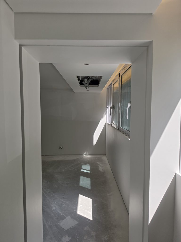
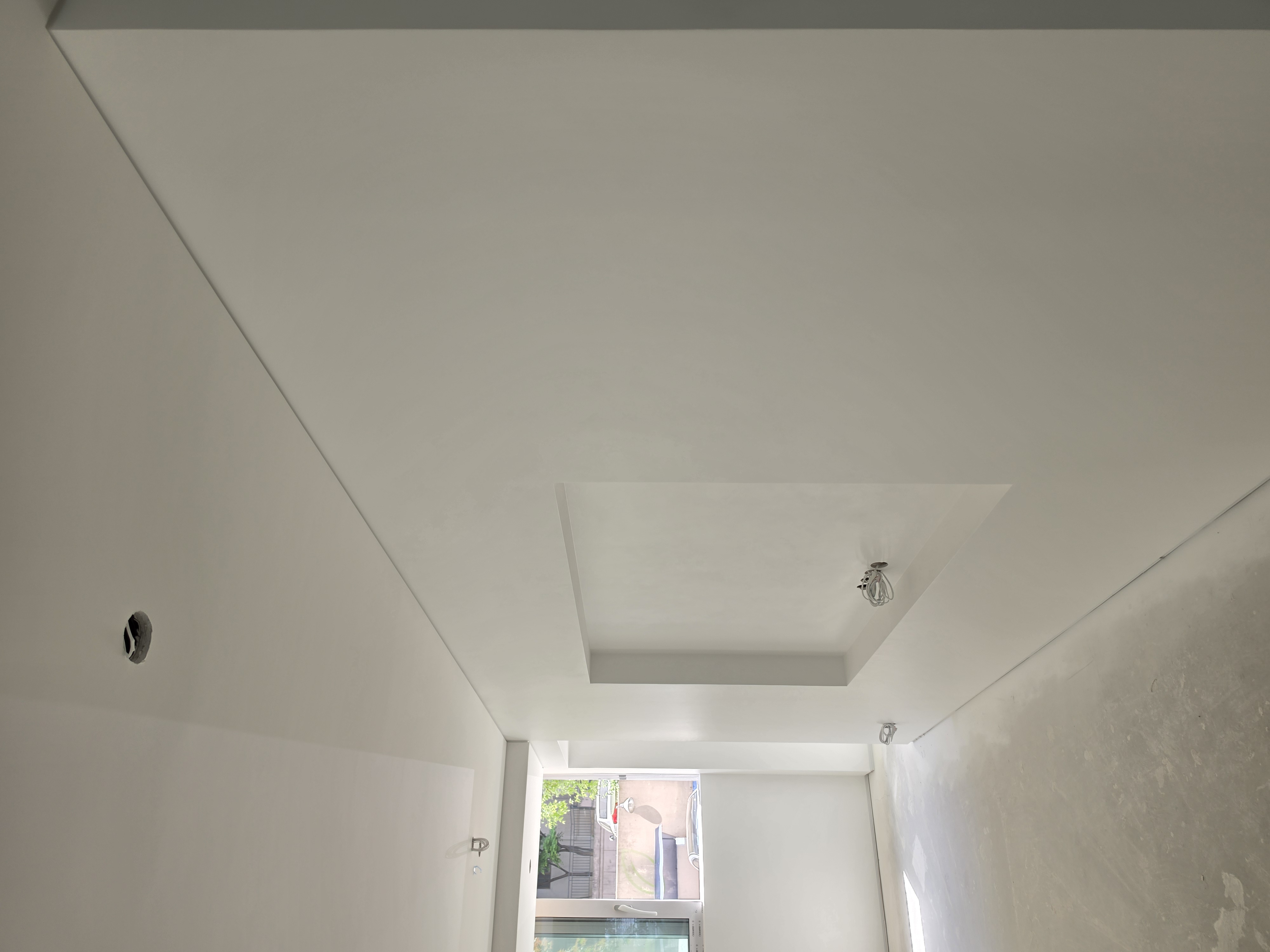
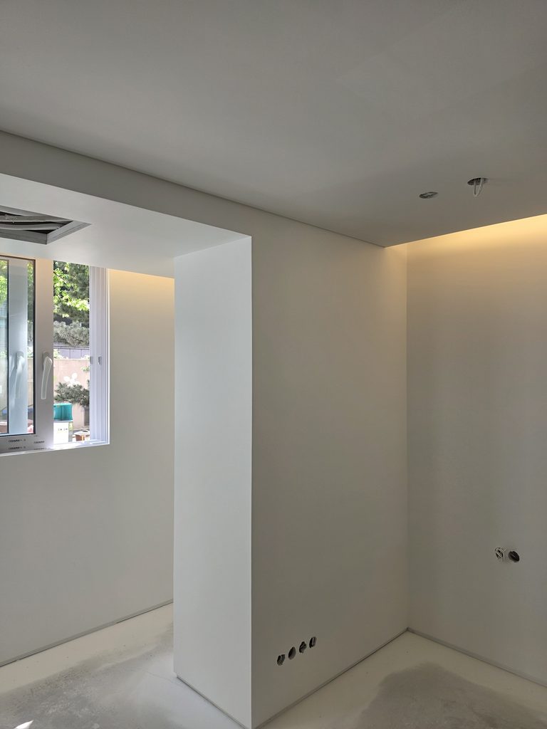
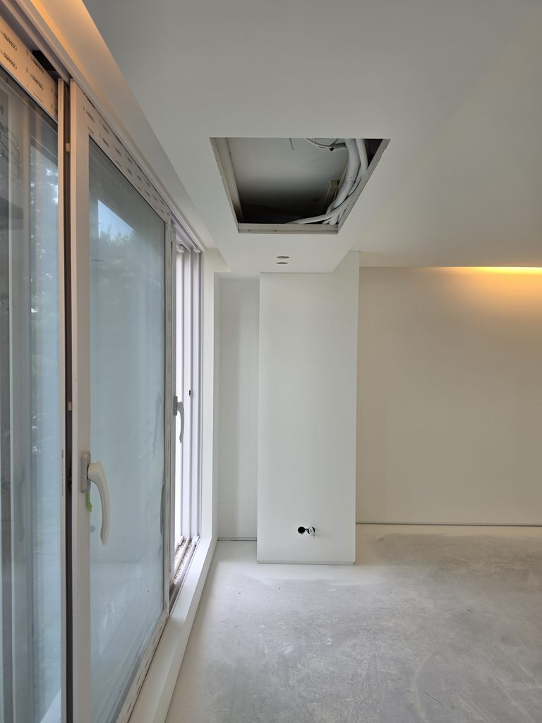
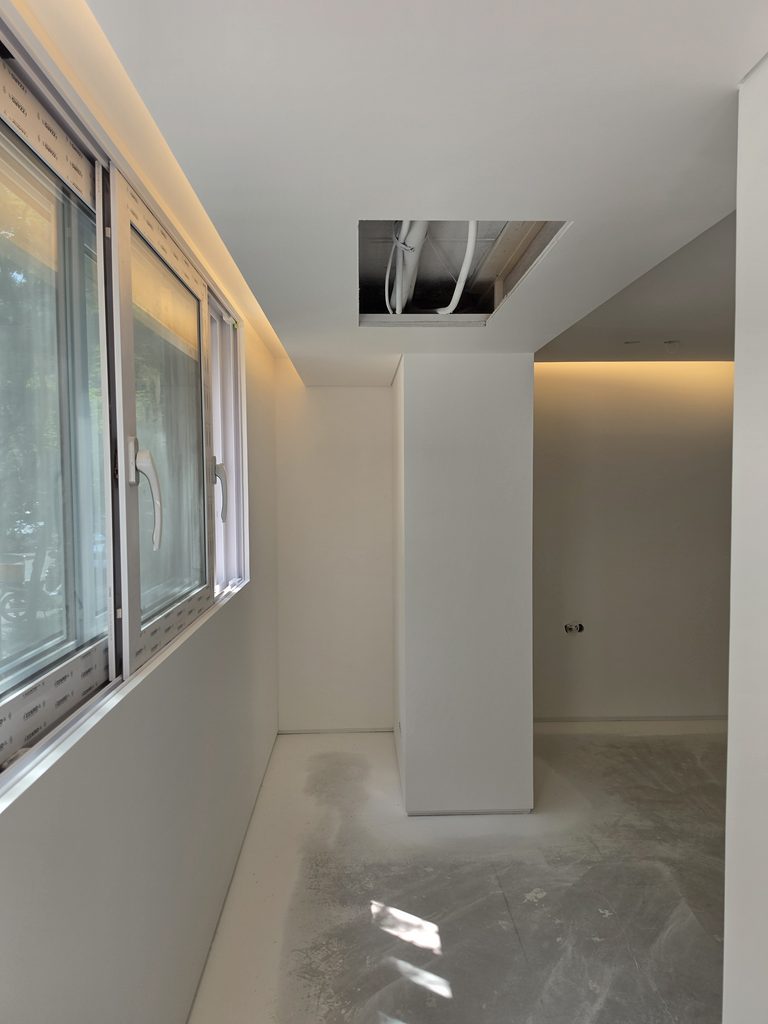
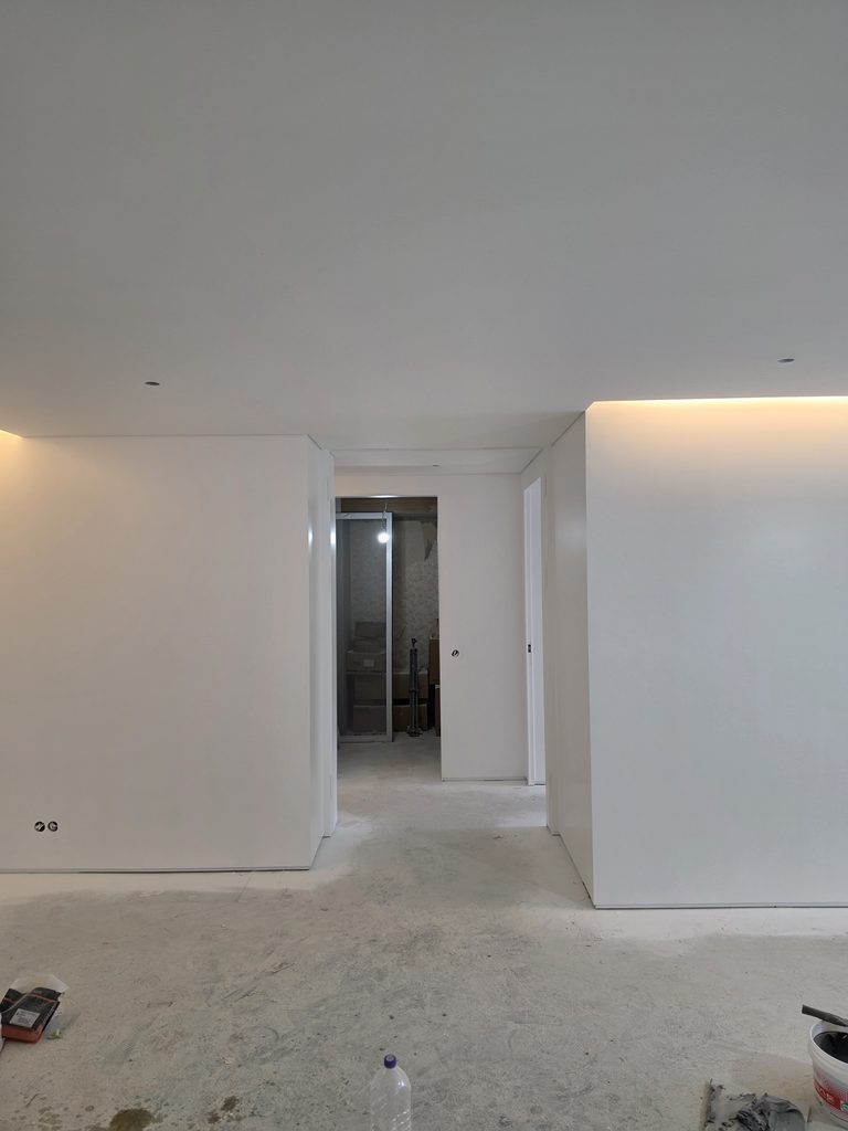
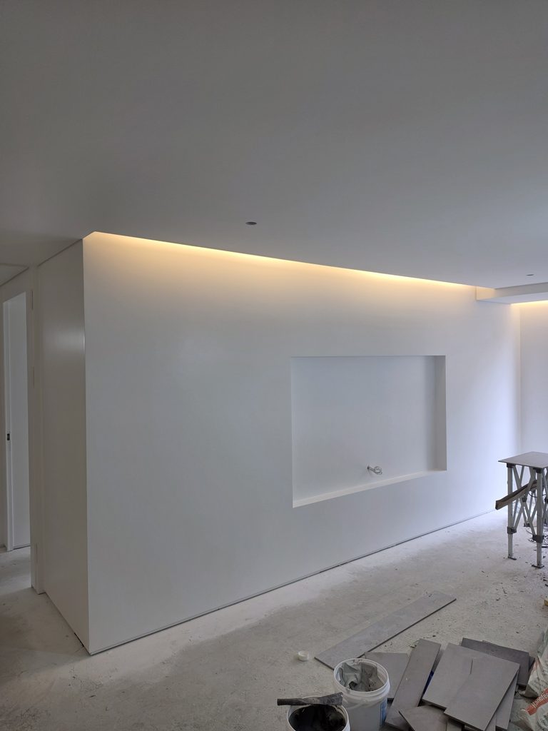
A high-end finish is often chosen in spaces where the wall itself becomes an important element of the interior. In spaces with negative molding, no-molding design, curved walls, long corridors, or indirect lighting, the quality of the surface becomes more visible.
하이엔드 마감은 벽 자체가 인테리어의 중요한 요소가 되는 공간에서 선택되는 경우가 많습니다. 마이너스 몰딩, 무몰딩, 곡면 벽, 긴 복도, 간접조명이 있는 공간에서는 면의 완성도가 더 잘 드러납니다.
The reason it feels refined is that the eye is not repeatedly interrupted by seams, shadows, or rough texture. When the substrate and paint film are calmly prepared, the color reads as one large continuous surface, and the entire space feels more organized.
고급스럽게 느껴지는 이유는 시선이 이음, 그림자, 거친 질감에서 자주 끊기지 않기 때문입니다. 바탕과 도막이 차분하게 정리되면 색상이 하나의 큰 면으로 보이고, 공간 전체가 더 정돈된 느낌을 줍니다.
In Korea, high-end finishing is often discussed together with full putty and full paint, but the terms themselves do not automatically guarantee quality. The existing wall condition, lighting plan, paint selection, and maintenance expectations have to match one another.
한국에서는 하이엔드 마감을 올퍼티, 올페인트와 함께 이야기하는 경우가 많지만, 단어만으로 결과가 보장되는 것은 아닙니다. 기존 벽 상태, 조명 계획, 페인트 선택, 유지 관리 기대치가 서로 맞아야 실제로 고급스러운 결과로 이어집니다.
Korean Site Standard_한국 현장 기준
In Korean apartments, humidity and seasonal changes should also be considered. During the rainy season, drying conditions can change, and in spaces where condensation is a concern, the wall condition needs to be understood before discussing only the color.
한국 아파트에서는 습도와 계절 변화도 함께 봐야 합니다. 장마철에는 건조 환경이 달라질 수 있고, 결로가 우려되는 공간은 색상보다 먼저 벽 상태를 이해해야 합니다.
Another practical criterion is tinting and repair. Even if there is an imported color you like, if future color matching, material supply, or schedule response is difficult, it can become inconvenient for the person using the space.
또 하나 현실적인 기준은 조색과 보수입니다. 마음에 드는 수입 컬러가 있더라도 추후 색 맞춤, 자재 수급, 일정 대응이 어렵다면 사용하는 입장에서는 불편함이 생길 수 있습니다.
That is why a high-end finish is better judged not from a single photo, but together with the substrate condition, lighting, sheen, maintenance, and whether the selected material can continue to be managed in Korea after the project is complete.
그래서 하이엔드 마감은 사진 한 장만 보고 판단하기보다, 바탕 상태와 조명, 광도, 유지 관리, 선택한 자재가 국내에서 계속 관리 가능한지까지 함께 보는 것이 좋습니다.
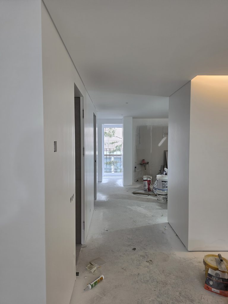
Apartment living room painted wall
아파트 거실 도장 벽
Finish Choice_마감 선택 기준
If the space needs a clean and practical finish, a general finish can be enough. If the design reduces visual boundaries and uses light and planes as important interior elements, the meaning of a high-end finish becomes greater.
공간이 깔끔하고 실용적인 마감을 필요로 한다면 일반 마감으로도 충분할 수 있습니다. 반대로 시각적인 경계를 줄이고, 빛과 면을 인테리어의 중요한 요소로 쓰는 공간이라면 하이엔드 마감의 의미가 더 커집니다.
The final choice should not be divided simply into general or premium. It is better to judge by where the wall is located, how often it is touched, what kind of lighting is used, how much maintenance is expected, and what level of surface completion the design requires.
최종 선택은 단순히 일반이냐 고급이냐로 나누기보다, 그 벽이 어디에 있는지, 손이 얼마나 닿는지, 어떤 조명을 쓰는지, 유지 관리를 얼마나 기대하는지, 디자인이 어느 정도의 면 완성도를 요구하는지로 판단하는 것이 좋습니다.
If you want to see the actual flow of site finishing, it is better to refer to Kari Paint’s real project posts rather than judge only from a checklist. The finish is decided not by one word, but by how all conditions are connected on site.
흐름을 보려면 체크리스트만으로 판단하기보다는 카리페인트의 실제 프로젝트 글을 참조하는 것이 좋습니다. 마감은 하나의 단어로 결정되는 것이 아니라, 현장에서 모든 조건이 어떻게 연결되는지에 따라 달라집니다.
If you are curious about the specific work flow, it is better to read Kari Paint’s real jobsite posts as well rather than looking only at a checklist. A finish is not determined by a single word; the result changes depending on how the site conditions are connected.
구체적인 작업 흐름이 궁금하다면 체크리스트만 보기보다 카리페인트의 실제 시공 현장 글을 함께 보는 것이 좋습니다. 마감은 하나의 단어로 결정되는 것이 아니라, 현장의 조건들이 어떻게 연결되는지에 따라 결과가 달라집니다. 😉
At a Glance_한눈에 정리
First, a high-end finish differs not so much in color as in the substrate, light, and the uniformity of the coating film. Second, a general finish is a practical choice, and if it fits the purpose of the space and the budget, it can be a fully good finish. Third, on Korean jobsites, it is better to choose the finish after considering supply, color matching, monsoon-season humidity, and upkeep.
첫째, 하이엔드 마감은 색상보다 바탕과 빛, 도막의 균일함에서 차이가 납니다. 둘째, 일반 마감은 실용적인 선택이며 공간 목적과 예산에 맞으면 충분히 좋은 마감이 될 수 있습니다. 셋째, 한국 현장에서는 수급, 조색, 장마철 습도, 유지 관리까지 보고 마감을 고르는 것이 좋습니다.
A good finish begins not with an expression that looks expensive, but with a surface that continues to feel comfortable even after being seen for a long time.
좋은 마감은 비싸 보이는 표현보다, 오래 보아도 편안하게 이어지는 면에서 시작됩니다.
함께 보면 좋은 글
Reasons to Focus on Product Characteristics Over Brand Names for Popular Paints
인기 페인트 브랜드, 이름보다 제품 성격을 먼저 봐야 하는 이유
50 Pyeong Luxury Villa in Banpo, Minus Molding, Minus Baseboard All-Party Paint Application🌠
반포 고급 빌라 50평, 마이너스 몰딩, 마이너스 걸레받이 올퍼티 페인트 시공🌠
Profile Picture Background: Why Is It Disappointing When Seams Are Visible?
여러분의 공간을 지금보다 더 가치있게 만드는
카리페인트
망설이지 마시고 문의주세요! ↓↓↓