
If you want a visually stable space, choose colors by considering the light, the base surface, and the mood or purpose of the room, rather than relying only on personal preference. Below, we will look at these conditions one by one.
시각적 안정감을 주는 색은 취향만으로 고르는 것이 아니라 빛, 바탕, 머무는 목적을 함께 봐야 하고 아래에서 조건별로 나누어 보겠습니다. 😊
Color Psychology_색채 심리
Color psychology is a way to understand how a color changes the feeling of a space before it becomes a design choice. It is not just about whether a color looks pretty or not, but about reading what kind of emotion a person feels while staying in that space.
색채 심리는 컬러가 예쁜지 아닌지를 넘어서, 사람이 그 공간에서 어떤 감정으로 머무는지를 읽는 기준입니다.
The same beige can look warm and cozy in morning sunlight, but feel a little yellow in a space with strong warm lighting. So when choosing a color that feels stable, it is better to check how it actually appears under real light before focusing on the color name.
같은 베이지라도 아침 햇빛에서는 포근해 보이고, 조명이 강한 공간에서는 노랗게 느껴질 수 있습니다. 그래서 안정감 있는 컬러를 고를 때는 색상명보다 실제 빛에서의 느낌을 먼저 보는 편이 좋습니다.
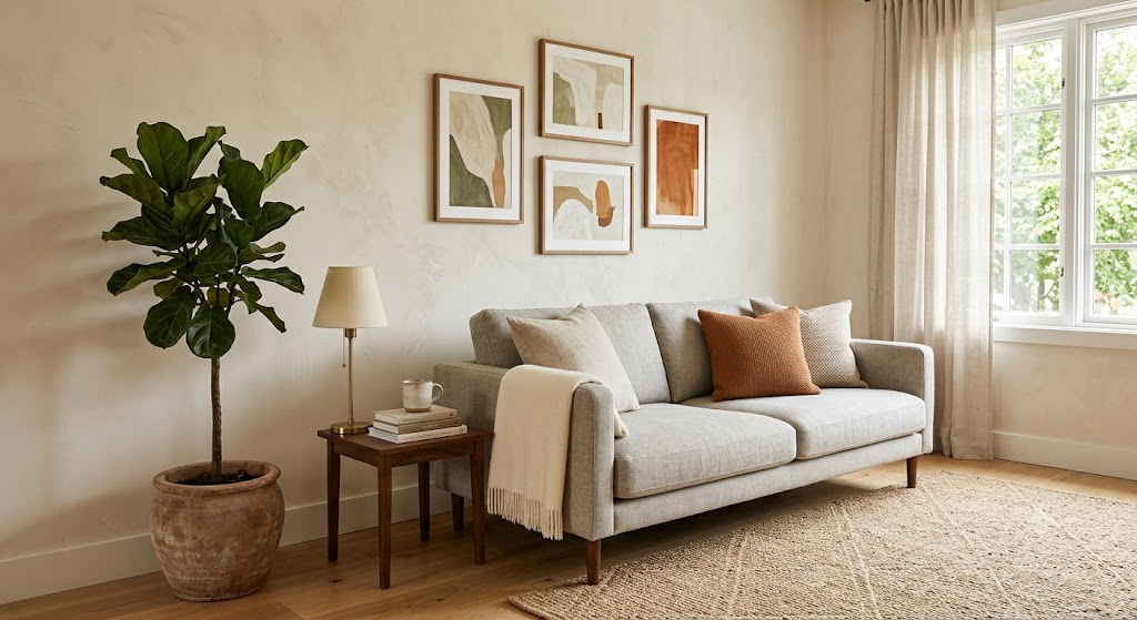
Neutral living room wall
뉴트럴 톤 거실 벽
In Korean apartments, interiors often need to be judged together with wallpapered substrates, white ceilings, and relatively short distances between walls. A deep color that looked stable in an overseas photo can feel heavy or cramped once it covers a larger area in an actual home.
한국 아파트에서는 도배 바탕, 흰 천장, 비교적 가까운 벽 간격을 함께 봐야 합니다. 해외 사진에서 안정적으로 보인 진한 색도 실제 집에서는 면적이 커지면 답답하게 느껴질 수 있습니다.
Warm Colors_따뜻한 색감
Warm colors make the wall feel a little closer and soften the overall mood of the space.
따뜻한 색감은 벽을 조금 더 가까이 느껴지게 하고, 공간의 분위기를 부드럽게 만들어줍니다.
Cream, beige, soft terracotta, and light skin-tone shades work well in places where comfort is needed, such as living rooms, cafés, and hospital waiting areas where people stay for a long time. However, if the yellow tone is too strong, the space can look dated, so the lighting color and flooring material should be checked together.
크림, 베이지, 연한 테라코타, 살색 계열은 편안함이 필요한 거실, 카페, 병원 대기 공간처럼 오래 머무는 곳에 잘 어울립니다. 다만 노란 기가 강하면 오래된 느낌으로 보일 수 있어 조명 색과 바닥재를 같이 확인해야 합니다.
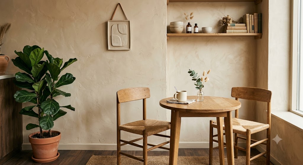
Beige cafe interior wall
베이지 톤 카페 실내 벽
The point that is often confusing on Korean sites is that a warm color does not always feel cozy. In spaces where rainy-season humidity is high and indoor lighting reads yellow, beige can look muddy, so using a slightly softer tone on large wall areas is the more stable choice.
한국 현장에서 많이 헷갈리는 부분은 따뜻한 색이라고 해서 무조건 포근한 것은 아니라는 점입니다. 장마철 습도가 높고 실내 조명이 누렇게 잡히는 공간에서는 베이지가 탁하게 보일 수 있으니, 넓은 벽은 한 톤 부드럽게 가는 것이 안정적입니다. 😅
Many studies examine how colors affect people’s emotions. For example, several studies suggest that certain colors can encourage positive feelings in people. Therefore, it is worth considering these points when choosing a color.
사람들은 색이 그들의 감정에 어떻게 영향을 미치는지에 대한 연구를 많이 하고 있습니다. 예를 들어, 여러 연구에 따르면 특정 색상이 사람들에게 긍정적인 감정을 유도할 수 있다는 결과가 있습니다. 따라서 색을 선택할 때는 이러한 점들을 고려하는 것이 좋습니다.
Cool colors lower the visual temperature and help the space feel calm and organized.
차가운 색감은 시각적인 온도를 낮추고, 공간을 차분하게 정돈해주는 역할을 합니다.
Blue gray, muted green, and low-saturation navy become quiet background colors when they are not used too strongly. They suit bedrooms, studies, and counseling spaces where focus and stability are needed.
블루 그레이(blue gray), 톤 다운된 그린(green), 낮은 채도의 네이비(navy)는 강하게 쓰지 않으면 조용한 배경이 됩니다. 침실, 서재, 상담 공간처럼 집중과 안정이 필요한 곳에 잘 맞습니다.
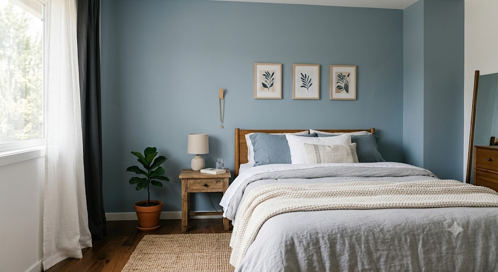
Blue gray bedroom wall
블루 그레이 침실 벽
A cool color can feel even colder in a room with little sunlight or a highly glossy floor. In Korean homes, the mood can become heavy when cool colors meet north-facing rooms, small rooms, or gray tile floors, so they need to be judged together with fabrics or wood materials.
차가운 색은 햇빛이 적거나 바닥 광택이 강한 공간에서는 더 차갑게 느껴질 수 있습니다. 한국 주거에서는 북향 방, 작은 방, 회색 타일 바닥과 만났을 때 분위기가 무거워질 수 있어 패브릭이나 우드 소재와 함께 보는 기준이 필요합니다.
Neutral Balance_뉴트럴 균형
Neutral colors are not colors with nothing in them; they are balancing colors that connect other materials and emotions.
뉴트럴 컬러는 아무 색도 아닌 컬러가 아니라, 다른 소재와 감정을 이어주는 균형의 색입니다.
White, off-white, greige, and light gray reduce visual noise and help furniture or lighting appear naturally. This is also the range people think about most when they want a sense of stability but do not want the space to feel too plain.
화이트, 오프화이트(off-white), 그레이지(greige), 라이트 그레이(light gray)는 시각적인 소음을 줄이고 가구나 조명이 자연스럽게 보이도록 도와줍니다. 안정감을 원하지만 너무 밋밋한 공간은 싫을 때 가장 많이 고민하는 구간이기도 합니다.
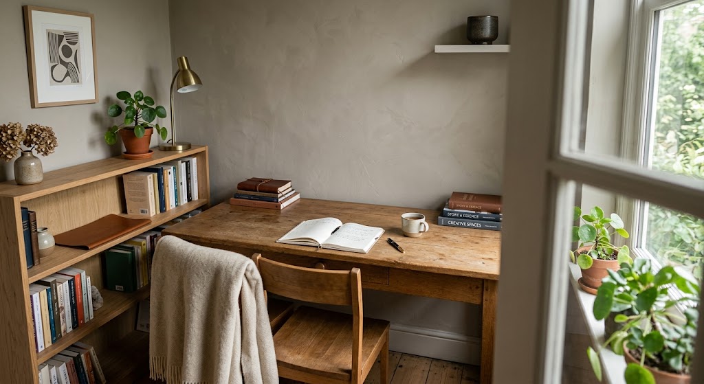
Greige study room wall
그레이지 톤 서재 벽
The key is undertone. Even within the same off-white range, a red cast feels warm, a gray cast feels calm, and a touch of green feels a little more natural. In Korea, the tinting standard and the actual wall substrate can appear different, so it is better to check the color under the full lighting conditions of the space rather than relying only on a small sample.
핵심은 언더톤(undertone)입니다. 같은 미색이라도 붉은 기가 있으면 따뜻하고, 회색 기가 있으면 차분하며, 초록 기가 섞이면 조금 더 자연스럽게 느껴집니다. 한국에서는 조색 기준과 실제 벽면 바탕이 달라 보일 수 있어 작은 샘플보다 전체 조명 조건에서 확인하는 것이 좋습니다. 😄
Light And Surface_빛과 바탕
A stable color depends on the surface as much as the color itself. A stable impression of color is not decided only by the paint color; it is strongly affected by the light and the condition of the substrate.
안정적인 색감은 페인트 색 자체만으로 결정되지 않고, 빛과 바탕의 상태에 크게 영향을 받습니다.
Matte surfaces absorb light softly, while glossy surfaces reflect light and reveal uneven areas more easily. A wall surface close to matte takes in light gently, while a surface with sheen reflects light and makes the condition of the plane more visible. That is why, even with the same color, the sense of stability changes depending on the sheen of the paint film and the flatness of the wall surface.
무광에 가까운 벽면은 빛을 부드럽게 받아들이고, 광도가 있는 벽면은 빛을 반사하면서 면의 상태가 더 잘 드러납니다. 그래서 같은 컬러라도 도막의 광도와 벽면 평활도에 따라 안정감이 달라집니다.
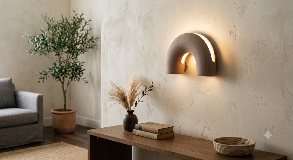
In Korean homes and commercial spaces, people often compare only the color chip and forget the base surface. There are cases where a color is chosen after looking only at a color chip, but then feels different on the actual wall. The depth and evenness of the color can change depending on whether the surface is over wallpaper, gypsum board, or an existing color remains underneath. If you are curious about the work flow, it is easier to understand by also looking at Caripaint’s posts from actual project sites.
한국 주거와 상공간에서는 컬러칩만 보고 결정했다가 실제 벽에서 다르게 느끼는 경우가 있습니다. 도배 위인지, 석고보드 면인지, 기존 색이 남아 있는지에 따라 색의 깊이와 균일감이 달라질 수 있습니다. 작업 흐름이 궁금하다면 카리페인트가 실제로 진행한 시공 현장 글을 함께 보는 편이 이해가 쉽습니다.
Choice Check_선택 기준
When choosing a stable interior color, check the room in this order of thought, not as a work process. When selecting an interior color that feels stable, it is better to separate the points as judgment criteria rather than as a work sequence.
안정감 있는 실내 컬러를 고를 때는 작업 순서가 아니라 판단 기준으로 나누어 보는 것이 좋습니다.
1. What feeling should remain in the space? First, look at what emotion should remain in this space. For rest, a soft low-chroma color is comfortable; for concentration, a calm cool tone; and for a sense of trust, a bright neutral range.
이 공간에서 남아야 하는 감정이 무엇인지 먼저 봅니다. 휴식이면 부드러운 저채도, 집중이면 차분한 쿨톤, 신뢰감이면 밝은 뉴트럴 계열이 편안합니다.
2. How does light enter the room? Check how light enters the space. In a space with a lot of light, such as a south-facing room, the color can appear lifted and brighter, while in a north-facing space or a room with small windows, the same color can look heavier.
빛이 어떻게 들어오는지 확인합니다. 남향처럼 빛이 많은 공간은 색이 밝게 뜰 수 있고, 북향이나 창이 작은 공간은 같은 색도 무겁게 보일 수 있습니다.
3. Will the color be easy to maintain? Check whether the color can be maintained. For walls that are touched often, spaces where children spend time, and circulation walls in commercial spaces, you need to consider not only the sense of stability but also how noticeable soiling will be and how manageable the paint film is.
유지 관리가 가능한 색인지 봅니다. 손이 많이 닿는 벽, 아이가 머무는 공간, 상공간의 동선 벽은 안정감뿐 아니라 오염이 눈에 띄는 정도와 도막의 관리성도 함께 봐야 합니다. 😉
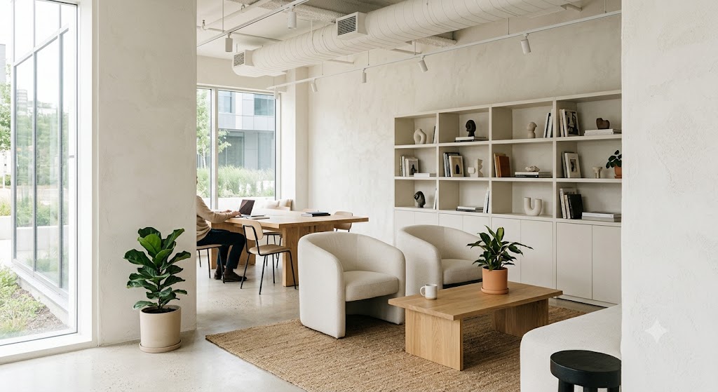
Off white commercial interior
오프 화이트 상업 공간 인테리어
The final color should not fight with flooring, furniture, and lighting. Rather than one color being beautiful on its own, people are more likely to feel stable when the whole space connects quietly.
마지막 컬러는 바닥, 가구, 조명과 싸우지 않아야 합니다. 색 하나만 예쁜 것보다 전체가 조용히 이어질 때 사람이 안정감을 느끼기 쉽습니다.
Space Mood_공간별 분위기
A living room needs a color that welcomes different activities. Because conversation, rest, and receiving guests all happen in the living room, a bright neutral or soft warm tone is more stable than an overly strong color. Even when using an accent color, it is less burdensome to place it on a limited area where the eye rests rather than across an entire large wall.
거실은 대화, 휴식, 손님맞이가 함께 일어나는 공간이라 너무 강한 색보다 밝은 뉴트럴이나 부드러운 웜톤이 안정적입니다. 포인트 컬러를 쓰더라도 넓은 벽 전체보다 시선이 머무는 일부에 두는 편이 부담이 적습니다.
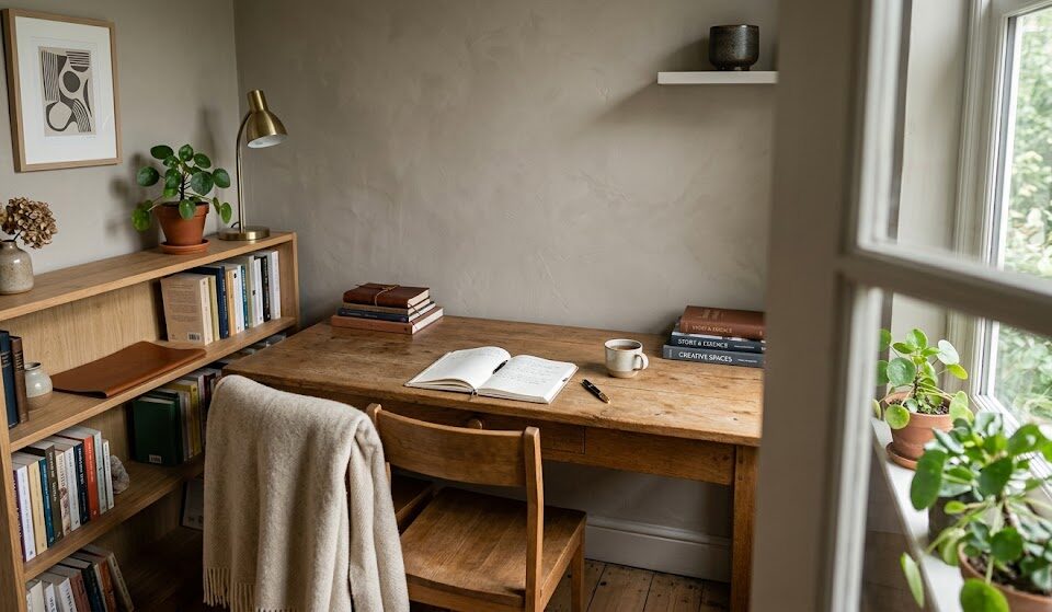
A bedroom needs less stimulation, and a workspace needs quiet focus. It is good to reduce stimulation in a bedroom, while a study or work area needs an orderly sense of concentration. Colors with settled tones, such as blue gray, low-chroma green, and greige, create a background that does not feel excessive.
침실은 자극을 줄이는 것이 좋고, 서재나 작업 공간은 정돈된 집중감이 필요합니다. 블루 그레이, 낮은 채도 그린, 그레이지처럼 톤이 가라앉은 컬러가 과하지 않은 배경을 만들어줍니다.
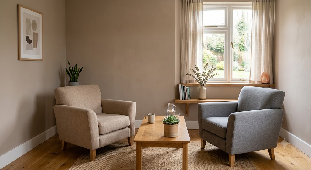
Neutral consultation room
뉴트럴 톤 상담실
For clinics, studios, salons, and offices, the color has to look stable to many people, not only to the owner. In commercial spaces used by many people, such as clinics, studios, salons, and offices, the sense of trust felt by visitors is as important as the operator’s taste. Colors that are too trend-driven can become tiring quickly, so keeping the main walls stable and adjusting the mood through smaller elements is a longer-lasting approach.
병원, 스튜디오, 살롱, 사무실처럼 여러 사람이 이용하는 상공간은 운영자의 취향만큼 방문자가 느끼는 신뢰감도 중요합니다. 너무 유행에 가까운 색은 빨리 질릴 수 있으니, 기본 벽은 안정적으로 두고 작은 요소에서 분위기를 조절하는 방식이 오래 갑니다.
At a glance_한눈에 정리
First, when choosing a calming color, you should look at the light, the substrate, and the purpose of staying in the space before personal taste. Second, warm colors create a cozy feeling and cool colors create a sense of order, but they can look different depending on the lighting and the size of the painted area. Third, in Korean interiors, a realistic standard is to consider the wallpapered substrate, monsoon-season humidity, color-mixing differences, and upkeep together.
첫째, 안정감 있는 색은 취향보다 빛, 바탕, 머무는 목적을 먼저 봐야 합니다. 둘째, 따뜻한 색은 포근함을 주고 차가운 색은 정돈감을 주지만, 조명과 면적에 따라 다르게 보입니다. 셋째, 한국 실내에서는 도배 바탕, 장마철 습도, 조색 차이, 유지 관리까지 함께 보는 것이 현실적인 기준입니다. 😄
What emotion does the space you are in now leave with you for the longest time?
지금 머무는 공간은 나에게 어떤 감정을 가장 오래 남기고 있나요?
함께 보면 좋은 글
Criteria to Consider When Choosing Samhwa Paint Products on Site
45-Pyeong Apartment in Heukseok-dong: Minus Molding, Minus Baseboard, Full Paint, Full Putty Installation
흑석동 45평 아파트, 마이너스 몰딩, 마이너스 걸레받이, 올페인트, 올퍼티 시공
A Café-like Space in a High School?!
여러분의 공간을 지금보다 더 가치있게 만드는
카리페인트
망설이지 마시고 문의주세요! ↓↓↓